Dover Saddlery Abandoned-Cart Email Series: Does It Convince Customers to Stop Horsing Around and Complete Their Purchase?
Preview without Images
Preview with Images
Dover Saddlery Email Grade: [B-]
Subject Line | 4 |
Preview Pane | 3 |
Eye Path | 3 |
Clarity of Message | 4 |
Call to Action | 4 |
Offer | 4 |
Credibility | 5 |
Sense of Urgency | 3 |
November 21, 2014 –
Organization Overview
In 1975, top-ranked U.S. Equestrian Team members Jim and David Powers founded the retail store Dover Saddlery in Wellesley, MA. With the goal of providing a broad selection of the best tack available to equestrians across the country, Dover introduced a comprehensive catalogue in 1982. The company launched a website in 2000, currently has more than 25 retail stores in the United States, and has grown to become a leading supplier of quality English horse tack and supplies, as well as riding apparel for horses and riders at all levels of competition.
Missed Opportunity to Express a Sense of Urgency in Subject Lines
This series of four abandoned-cart emails was sent to a Dover Saddlery customer who placed an item in the online shopping cart and didn’t finish the transaction. When it comes to the optimum number of emails in an abandoned-cart series, three has been found to be the typical “sweet spot” and recommended best practice. However, Dover may have tested the series for its target audience and found that four emails garnered the best response.
The following are the subject lines in the order in which the emails were sent. (The first email was sent a couple days after the cart was abandoned and the rest were spread out over the next several days.)
- You left something important in your shopping cart
- We’re holding items in your shopping cart for you
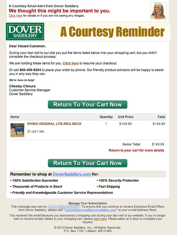
- The items in your shopping cart will be released soon
- Final reminder to complete your order
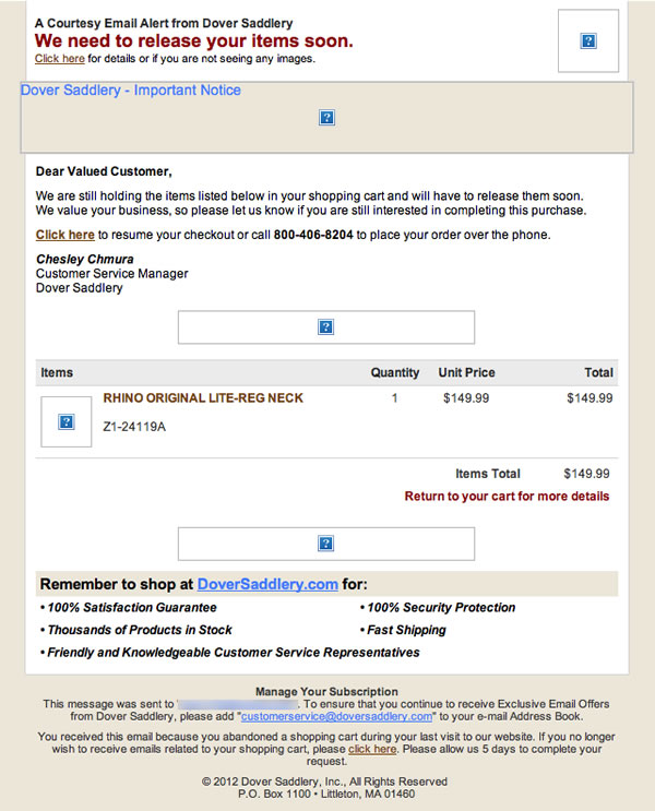
Preview without Images 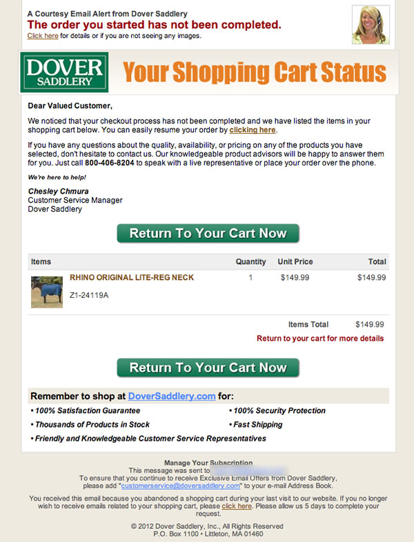
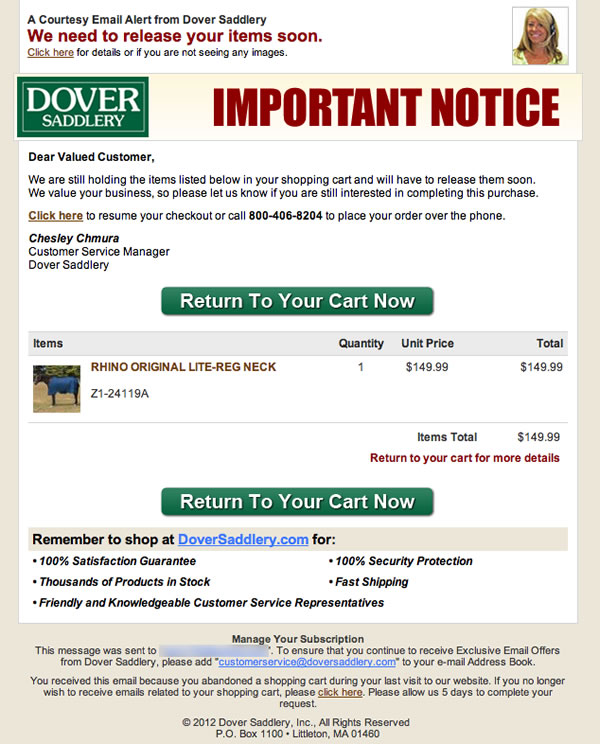
Preview with Images |
The first subject line lets recipients know immediately what the email is about and yet still creates some curiosity to drive opens by not naming the item. As the series progresses, the subject line indicates that the shopping-cart items are not going to be held indefinitely.
In terms of sense of urgency, however, this abandoned-cart email series misses a huge opportunity by not providing a solid timeline of when items would be removed from the cart. Recipients are told in the third email the items will be “released soon.” And in the last email, recipients learn that the products in the cart will be returned to the general inventory by the end of that day. Even then, recipients must read the copy within the email message to find this information, since it isn’t included in the subject line or headlines.
Preview Pane & Eye Path Could Be Stronger
Although the preview pane without images gets the message across about the content of the email, there’s little motivation for recipients to download the images. Plus, the call-to-action buttons are blank, and there are no clickable links to take recipients to their shopping carts.
The eye path also could be stronger. For example, the headers in each of the emails are competing with the headlines, which aren’t very effective. And though the calls to action are plentiful and prominent, shifting the first button to the left and the second one to the right (beneath the pricing) would help lead readers’ attention more effectively through the email message.
Brand Credibility Is Highlighted
Dover has a reputation for providing high-quality, affordable products, and this email series does a great job of highlighting the brand’s credibility. The bullets located near the bottom of the email, for example, reaffirm the value customers get by shopping at Dover. In fact, “100% Security Protection” is the bullet aptly positioned closest to the product price — the part of the sale that causes the most anxiety in customers. Plus, Dover’s customer service manager’s signature and photo are also included in the email message (though placing the customer service manager’s photograph next to her signature likely would have been even more effective).
Overall, this abandoned-cart email series successfully reminds Dover customers to complete the online purchases that they started. The tone and design of these emails, however, is very transactional. While this approach can be effective, presenting the information as a friendly service that makes it easy for people to find and purchase the products they want may work even better in encouraging customers to complete their purchases.
Call-to-Action Buttons: Prominent & Plentiful, But Could be More User-Centric
The ample-size, bright green call-to-action buttons succeed at drawing a customer’s eye. And the messaging of the call to action is good: “Return to Your Cart Now.” On the other hand, saying “Return to My Cart Now” would make the call to action more user-centric.
Disclaimer: FulcrumTech does not have access to the performance data relating to this promotional email, so any tests performed on this email can’t be reflected in FulcrumTech’s commentary.