GreaterGood Email Review: How Does This Oops Email Score?
GreaterGood Email Grade: [B-]
Subject Line & Preheader | 5 |
Preview Pane | 3 |
Eye Path | 3 |
Clarity of Message | 2 |
Call to Action | 2 |
Offer & Urgency | 3 |
Congruency | 5 |
Email grades are based on a 5-point scale: A = 5, B = 4, C = 3, D = 2, F = 1
March 13, 2018 –
Organization Overview
Based in Seattle, Washington, GreaterGood.com, Inc., is an online retailer of a wide range of products, including clothing, jewelry, gifts, pet supplies, home décor, and animal-themed products. GreaterGood also operates a network of charity-driven websites that started with the Hunger Site. Proceeds from GreaterGood’s Gifts That Give More and Click-to-Give websites are used to help:
- People (The Hunger Site, The Breast Cancer Site, The Veterans Site, The Autism Site, The Diabetes Site, and The Literacy Site)
- Pets (The Animal Rescue Site)
- The planet (The Rainforest Site).
For example, every purchase at the Animal Rescue Site funds food and care for rescued animals. GreaterGood has given more than $40 million to charities worldwide since its founding in 1999, according to the organization’s website.
Effective Subject Line for an Oops Email
“Sorry! Take $5 Off + Your Corrected Email Is Inside!”
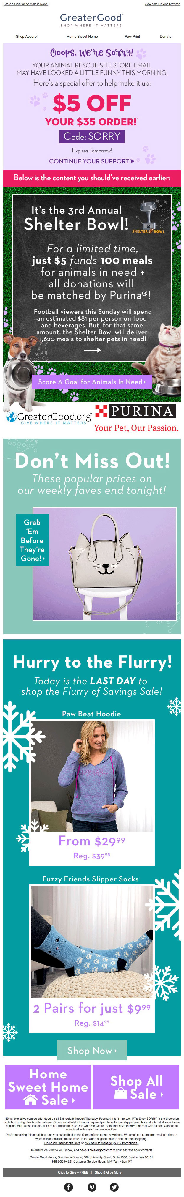
This was the subject line of an oops email sent to a GreaterGood customer on the Wednesday morning before the Super Bowl. It was delivered soon after the original email, which rendered poorly (see above).
The subject line is highly effective, especially for an oops email. Keeping the subject line short and frontloading it with “Sorry! Take $5 Off,” grabs attention and helps it stand out in the inbox. In fact, the recipient opened this email before even noticing the original botched email, which, too, had a strong subject line: “Score a Goal for Animals in Need!  ” This original email subject line was then used effectually as the preheader in the oops email (minus the football emoji).
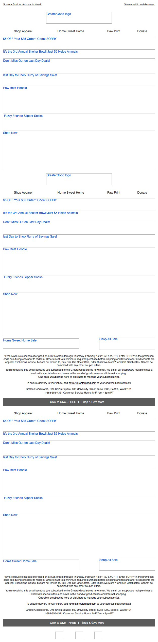
Room for Improvement in the Preview Pane and Eye Path
The preview pane without images does a good job of conveying all of the important information in the email message by using alternative text for the images, including the $5-off offer and discount code. In addition, the detailed product descriptions (e.g., “Fuzzy Friends Slipper Socks”) help motivate recipients to download the images. However, the same preview pane is repeated 3 times.
The eye path in the first block of this email is strong and clearly presents the details of the special offer and coupon code (“SORRY”). As a whole, however, this email has a lot going on. It features a long, straight, and very busy layout. In addition, there are sections with dynamic content, which includes a carousel display of the “weekly faves,” as well as alternating product shots of the “Fuzzy Friends Slipper Socks” in 2 different colors.
The Email Message and Primary Call to Action Need Some Clarity
The email message is clear in the first email section with regard to the “Ooops, we’re sorry!” and $5-off discount offer. But the rest of the message is not as clear. For example, the primary call to action (located in the top section) is: “CONTINUE YOUR SUPPORT.” Although GreaterGood is collecting donations for their “3rd Annual Shelter Bowl” in the second section of the email (and what would have been the top of the original email), the $5 is a discount off a $35 sales order. So, a call to action such as “Shop Now”—which is the copy used in the secondary calls to action further down in the email—would be clearer and help with the overall clarity of the message. The entire email is clickable, including the coupon code button; however, the primary call to action should be more prominent.
Strong Offer, But Urgency Isn’t Promoted Well Enough
The offer of a $5 discount on a $35 order is a good one. Plus, there’s a sense of urgency in that the offer expires the next day. However, the “Expires Tomorrow!” copy is too small to be as effective as it could be.
The congruence between the subject line and the email once it’s opened is great, with the first line of copy explaining it all: “Ooops, we’re sorry! YOUR ANIMAL RESCUE SITE STORE EMAIL MAY HAVE LOOKED A LITTLE FUNNY THIS MORNING.”
GreaterGood is an e-commerce company with the noble mission of supporting charities that help people, pets, and the planet. This oops email provides a good example of how to effectively deal with an email mistake; however, we found a few improvements that would likely help drive even better performance results.
Disclaimer: FulcrumTech does not have access to the performance data relating to this promotional email, so any tests performed on this email can’t be reflected in FulcrumTech’s commentary.