CVS/pharmacy Trigger Email: Is It Just What the Doctor Ordered?

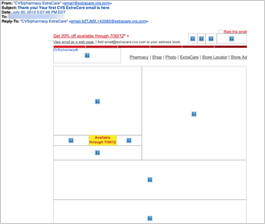
Preview without Images

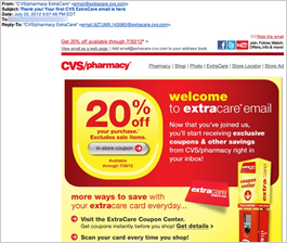
Preview with Images
CVS/pharmacy Email Grade: A
Subject Line | 4 |
Preview Pane | 5 |
Eye Path | 5 |
Clarity of Message | 5 |
Call to Action | 5 |
Offer | 5 |
Sense of Urgency | 5 |
Credibility | 5 |
8/13/12 —
Company Overview
CVS/pharmacy is the leading retail pharmacy in the United States, with more than 7,300 CVS/pharmacy and specialty pharmacy locations nationwide.
This Trigger Email Was Sent Promptly, and the Subject Line Works Well
This email was sent to a CVS/pharmacy customer who was asked to update his email address during an in-store transaction and, in return, was promised a 20%-off coupon. Within 15 minutes after leaving the store, he received this email. Since the customer was expecting this email, the following subject line works well: “Thank you! Your first CVS ExtraCare email is here.” In this case, the customer opened the email immediately on a mobile device. If customers don’t check their email inboxes soon after leaving the store, however, mentioning the 20%-off coupon in the subject line would likely give more incentive to open the email.
Strong Preview Pane and Eye Path
The preview pane without images is also very effective, as the 20%-off offer and the promotion deadline are included and prominent “Get 20% off available through 7/30/12” is in red type and located in the upper left corner, while the deadline date is in red type and highlighted in a yellow block. The sense of urgency in this email is high, with the offer expiring just 10 days after the customer got the message.
The eye path in this email is strong, as well. From the CVS/pharmacy logo in the upper left corner, the subscriber’s eye is drawn to the large 20% off in red type against a bright yellow background, to the prominent call-to-action button. Simply stating, “in-store coupon,” the call to action is clear and doesn’t distract from the email message.
Effective Offer and High Credibility
The 20% offer is great. Plus, when customers click through, they are given a way to redeem the coupon without having to print it out. The credibility also is high in this email. In addition to providing links to answer any questions customers may have about CVS/pharmacy’s ExtraCare card program, there’s also a “rate this email” link (in the upper right corner) that asks for customer feedback.
Pairing bright yellow with the red in the CVS/pharmacy logo is a bold, easy-to-read color combination, which reminds us of the colors used in the Tylenol logo. At FulcrumTech, we wondered if that was done intentionally. The use of different color combinations would be an interesting element to test in this email.
Great Example of a Trigger Email
Overall, this is a great example of a trigger email. Integrated with the in-store purchase, the email was sent promptly, contained the offer that was expected, and included a coupon that was easy to redeem. All of these elements work together to increase the likelihood that subscribers will open the email and use the coupon, driving additional sales.
Disclaimer: FulcrumTech does not have access to the performance data relating to this promotional email, so any tests performed on this email can’t be reflected in FulcrumTech’s commentary.