Drugstore.com Email: Shows What It Takes to Deliver a Healthy Nurturing Campaign

Preview without Images

Preview with Images
Drugstore.com Email Grade: A
Subject Line | 5 |
Preview Pane | 5 |
Eye Path | 5 |
Clarity of Message | 5 |
Call to Action | 4 |
Offer | 5 |
Credibility | 5 |
Sense of Urgency | 5 |
January 18, 2013 —
Company Overview
Drugstore.com (http://www.drugstore.com/) is an online retailer of name-brand and private-label health and beauty products, personal-care items, over-the-counter pharmaceuticals, and household goods. As the result of a partnership with GNC Corporation, drugstore.com also sells vitamins and other wellness products. In addition, high-end cosmetics and skin-care products are available to consumers through drugstore.com’s Beauty.com unit. In 2011, the drugstore chain Walgreens purchased drugstore.com.
Subject Line and Preview Pane Clearly Summarize the Email Offer
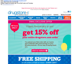
This trigger email was sent as a thank you to someone on the third anniversary of placing her first order with drugstore.com. The subject line does a great job of summing up the contents of the email: “Happy Anniversary: get 15% off ANY order until Thursday.”
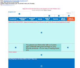
Thanks to an effective use of alt-text, recipients can see the main message of this email even if they just view it in the preview pane without images. All the important information is included, such as why the email was sent, the discount offer, and where to click to redeem the offer.
Design May Be Simple, But the Eye Path Works Well
The design of this email is very simple, which makes it quick and easy for recipients to digest the email message. The eye path is also very effective, leading from the drugstore.com logo in the upper left corner to the offer and call to action, which are both prominent and centered. The big and bold “FREE SHIPPING” incentive, located below the discount offer, also stands out.
Strong Offer and Sense of Urgency
The offer is strong — 15% off an entire order. From the start, recipients know that they have only until Thursday, which was 2 days after the email was sent, to take advantage of the discount. The sense of urgency to respond is emphasized in the red balloon to the left of the offer, with copy that reads “48 hours ONLY!”
Secondary Call to Action Creates Some Confusion
The first call to action for the primary 15% discount offer — “click to redeem” — really pops due to its central location in the email and the use of white type on a bright red button. The second call to action, however, is somewhat confusing. If recipients click the “shop now” button, will they get the 15% off in addition to free shipping for orders of $25 dollars or more? We assume that is the case. But simply including the everyday free-shipping offer without a call-to-action button would have been less confusing for recipients.
Drugstore.com is a huge brand with high credibility. Using customers’ purchase history to celebrate an anniversary with an incentive discount offer makes for a great nurturing campaign. In this way, drugstore.com helps encourage and maintain interest, engagement, and loyalty among their customer base.
Disclaimer: FulcrumTech does not have access to the performance data relating to this promotional email, so any tests performed on this email can’t be reflected in FulcrumTech’s commentary.