Victoria’s Secret Reengagement Email Series: Is It Alluring Enough to Reengage Inactive Customers?

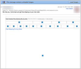
Preview without Images

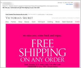
Preview with Images

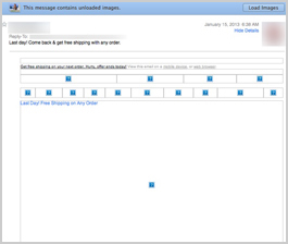
Preview without Images

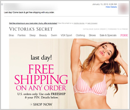
Preview with Images
Victoriassecret.com Email Grade: B
Subject Line | 5 |
Preview Pane | 3 |
Eye Path | 3 |
Clarity of Message | 5 |
Call to Action | 4 |
Offer | 3 |
Credibility | 5 |
Sense of Urgency | 5 |
February 4, 2013 —
Company Overview
Victoria’s Secret is a leading American retailer of women’s lingerie, fashion, and beauty products. Founded in 1977, the company sells its products in over 1,000 stores across the United States, as well as through catalogs and its website.
Subject Line and Preview Pane Clearly Summarize the Email Offer
These two emails were sent to a customer who had previously made an online purchase from Victoria’s Secret but hadn’t shopped at the website recently. The first subject line effectively communicates to the recipient right away why the email was sent: “We miss you. Come back and get free shipping on your next order.” Sent 2 days later, the second email’s subject line adds a sense of urgency for the free shipping incentive: “Last day! Come back & get free shipping with any order.”
Preview Panes Work, But Is the Offer Compelling Enough to Motivate Opens, Click Throughs, and Conversions?
In the preview panes without images, the alt tags do a good job of communicating the primary message of free shipping on any order until Tuesday. But is the offer compelling enough to motivate people to download the images and make a purchase? Free shipping is becoming more of a standard for online retailers, so many customers expect it today.
To take advantage of the free shipping with their purchase, customers must use a nine-character pin number in addition to an offer code. Because the pin number is in text in both email designs, customers can easily copy and paste it to redeem the offer. As a result, though, the number displays in the center of the preview pane without any explanation, which makes it unclear to recipients the meaning of that number.
Eye Path Is Better in the First Email Compared to the Second Email (at Least for Women Customers)
The eye path in the first email is better than in the second one. The offer for free shipping on any order can’t be missed in the first email, as it is centered and in reverse type against a bright pink background — a color closely associated with the Victoria’s Secret brand. Readers’ eyes are also drawn to the semi-annual clothing sale below the offer, which serves to remind them that it’s a good time to take advantage of free shipping.
In the second email, recipients must scroll down to see the entire message, including the semi-annual sale details. We suggest that men would be more inclined than women to scroll down to view the entire image on the right of the Victoria’s Secret model in lingerie. Does Victoria’s Secret target advertising and segment their list based on whether recipients are male or female? It would be interesting to see the results of testing in this area.
Call to Action Is Clear, But Doesn’t “Pop”
The call to action — “SHOP NOW” — is clear, but it doesn’t stand out on the page in either of the two emails. If it were in larger type and in colors that popped, the call to action would be more conspicuous to recipients. Customers don’t need to click on the “SHOP NOW” calls to action, however, to begin shopping at the Victoria’s Secret website — they can click anywhere on the entire image.
High Credibility and Strong Sense of Urgency
As one of the world’s most renowned lingerie brands, Victoria’s Secret has very high credibility. Giving customers only 3 days to take advantage of the free-shipping offer creates a strong sense of urgency in this reengagement series. This sense of urgency is emphasized in the second email that prominently announces the last day of the offer.
The first email in this series was sent on a Sunday and the second on the following Tuesday. Is this the best number of emails and timing to get an optimum response? At FulcrumTech, that’s something we would test for our clients. A series of three emails spread out over a week, for example, may be more effective than two emails sent within 3 days.
Disclaimer: FulcrumTech does not have access to the performance data relating to this promotional email, so any tests performed on this email can’t be reflected in FulcrumTech’s commentary.