Kohler Email Review: This Email Newsletter Has Everything, Plus the Kitchen Sink!

Preview without Images

Preview with Images
Kohler Email Newsletter Grade: [A]
Subject Line | 5 |
Preview Pane | 5 |
Eye Path | 5 |
Clarity of Message | 5 |
Call to Action | 5 |
Offer* | 0 |
Credibility | 5 |
Sense of Urgency* | 0 |
August 13, 2013—
Company Overview
Founded in 1873 and headquartered in Kohler, WS, Kohler Company (www.us.kohler.com) is one of the oldest and largest privately held companies in the United States. Kohler is a global leader in the manufacture of kitchen and bath products, engines and power systems, premier furniture, cabinetry and tile, with more than 50 manufacturing locations around the world. Kohler also owns and operates two of the world’s best five-star hospitality and golf resorts in Kohler and St Andrews, Scotland.
Intriguing Subject Line and Preview Pane
This email newsletter was sent to a subscriber who had signed up at Kohler’s website to receive their email newsletter. The from line — “Kohler Newsletter” — lets recipients know right away that this email is the company’s monthly newsletter and there’s likely kitchen and bath product information. But the subject line catches subscribers’ attention as they scroll through the inbox: “Rock & roll home tour, award-winning kitchen sinks & more.” This is an intriguing subject line that likely drives recipients to open the email to take a tour of a so-called “rock and roll home.” What makes this place a rock and roll home? Is it the house of a famous rock star?
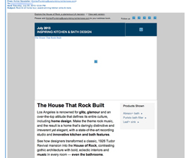
The preview pane without images is also an especially strong one and continues to pique interest. The alternative text is used effectively to provide adequate information, yet still entice subscribers to download the images and find out more.
Eye Path Is Well Done
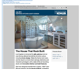
From top to bottom, this newsletter has a classy and clean design. The eye path leads from the header with Kohler’s logo, to a high-quality photograph of a glamorous bathroom, to the feature headline, “The House That Rock Built,” to the primary call to action. The selectively bolded words in the feature article summary also help take the reader’s eye and interest to the call to action. The attractive photos accompanying the other newsletter articles draw subscribers’ interest down the rest of the page. And for subscribers who may want to share the newsletter with friends, the bright orange “Share” button stands out at the bottom of the page.
Clear and Concise Copy Makes Recipients Want to Read More
The amount of copy describing each article is short and sweet — providing just enough information to make subscribers want to read more. Plus, the feature format provides a fun and imaginative way to showcase some of the company’s products.
Outstanding Calls to Action and High Credibility
The calls to action are thoughtful and customized for each article, including “TOUR THE HOME” and “EXPLORE THE SINKS.” This is a nice, creative touch that’s so much more interesting than the typical “Read more” call to action.
The credibility for the Kohler brand is high, and this newsletter does a great job of conveying the quality and innovative design associated with the company’s product line.
Disclaimer: FulcrumTech does not have access to the performance data relating to this promotional email, so any tests performed on this email can’t be reflected in FulcrumTech’s commentary.