DoggieFood Email: Is It as Doggone Good as It Could Be?

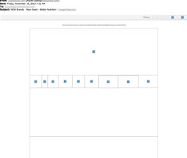
Preview without Images

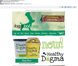
Preview with Images
DoggieFood.com Email Grade: [D]
Subject Line | 2 |
Preview Pane | 1 |
Eye Path | 2 |
Clarity of Message | 2 |
Call to Action | 2 |
Offer | 3 |
Credibility | 2 |
Sense of Urgency | 1 |
March 15, 2014 –
Organization Overview
With its headquarters located in Cumberland, RI, DoggieFood.com is a small, family-owned company that sells organic and natural pet foods, supplements, and supplies for dogs, cats, birds, rabbits, and horses. According to the company’s website, DoggieFood.com strives to provide the lowest prices in the industry, while supplying their customers with the best possible food for their pets.
Lacking Incentive in the Subject Line and Preview Pane
“NEW Brands – New Deals – Better Nutrition” is the subject line of this promotional email sent to a DoggieFood.com customer who had subscribed to receive the company’s emails. It appears as though the company was trying to create some excitement by using “new” to describe the brands and deals to be revealed in the message. There’s very little incentive, however, to motivate recipients to open the email. Perhaps by revealing some specifics of the “new deals” would have helped to drive up the open rate for this email.
The preview pane without images also provides no incentive for people to download the images. And unless they download the images, recipients have no idea what the email is all about. Because alternative text wasn’t used for the images, all that the recipients see is a series of blank boxes. Plus, there’s no opportunity available for them to view a web version of the email. The only clickable call to action in the preview pane is the unsubscribe message at the very top, which makes us suspect the number of unsubscribes was unusually high for this email.
Competing Elements Lead to Confusing Eye Path and Unclear Main Message
Confusion is the first word that comes to mind when opening this email. There are too many competing elements and no clear eye path or main message. The email is divided into five distinct sections, which are all about the same size.
The two “Shop Now” call-to-action buttons blend into the email design. And again, there’s no incentive for recipients to click and make a purchase. A new product – Healthy Dogma – is prominently featured. But information about the advantages of the product isn’t included to encourage people to buy it. Recipients have to look very hard to see the incentive that says, “Click Here for Instant Savings Off MSRP,” located under the call-to-action button.
If recipients take the time to search and carefully read this email, they’ll find that there are some good offers. In addition to free shipping on orders over $49 announced at the top, coupon codes to get 5%, 10%, and 15% off orders are also included in the “Shop & Save on Our Already Low Prices” section.
More Credibility and a Greater Sense of Urgency Needed
The only sense of urgency is buried in the tiny typeface in the lower section of this email about Facebook. DoggieFood.com offered to donate one cup of pet food for each “Like” it got on Facebook, but only during the months of September and October. If that sense of urgency was promoted more prominently, more people may have been motivated to “like” DoggieFood.com on Facebook. A specific mention about where the donations are going – such as a local animal shelter – would also add credibility to the promotion. But, promoting this higher could dilute what may be the more important call to action, which is to get people to click through to shop.
In terms of credibility, DoggieFood.com is a small company that doesn’t have the name recognition and well-known reputation typically associated with large national brands. So that means DoggieFood.com needs to do more to let people know about their good business practices and customer satisfaction. For example, customer testimonials and seals such as from the Better Business Bureau are ways organizations can help build credibility in their email messages.
DoggieFood.com seems to have a lot to offer in terms of quality, price, and selection of pet food and products. By narrowing down the focus of the company’s promotional emails and providing additional information about the benefits of purchasing their products, and encouraging click-throughs with enticing offers, more prospects and customers will be more incentivized to respond.
Disclaimer: FulcrumTech does not have access to the performance data relating to this promotional email, so any tests performed on this email can’t be reflected in FulcrumTech’s commentary.