TOMS Shoes Promotional Email: TOMS Steps Up with a Responsive Email Design

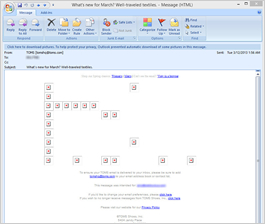
Preview without Images

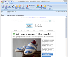
Preview with Images
TOMS Email Grade: B
Subject Line | 3 |
Preview Pane | 1 |
Eye Path | 5 |
Clarity of Message | 5 |
Call to Action | 5 |
Offer | 5 |
Credibility | 5 |
Sense of Urgency* | 0 |
April 4, 2013 —
Company Overview
“One for One.” That’s the slogan of TOMS — a shoe company founded by entrepreneur Blake Mycoskie in 2006 that donates a pair of new shoes to a child in need for every pair of shoes purchased. While on a trip to Argentina, Mycoskie was struck by the poverty and the vast number of children without shoes. So he reinvented the Argentine alpargata — a simple canvas slip-on shoe — for the U.S. market.
Soon after the company started, an article about TOMS and its product and philanthropic mission ran in the Los Angeles Times. As a result, TOMS received orders for nine times the available stock and sold 10,000 pairs of shoes during their first 6 months of operation. By 2012, over 2 million pairs of new shoes had been donated to children in need worldwide. The company now also sells eyewear, and with every pair of glasses purchased, TOMS donates a portion to help give sight to a person in need.
A Great Example of Responsive Design
TOMS sent this promotional email to a customer who had signed up to receive emails from the company. And because it was coded to be responsive —
optimized for the screen or platform it was being viewed on — the recipient could easily read and respond to it on his or her iPhone. As we discussed in a previous NewsLever feature article — “How to Use Responsive Email Design to Optimize Your ROI” — designing emails with your mobile users in mind is vital today, given the growing trend of people using mobile devices to read their emails.
In this email, TOMS did a great job on the mobile design, including:
- Creating a single-column design
- Making the calls to action large enough to easily view and use on a touch screen
- Rotating the graphics on a cycle, so the various images featured in the full-screen version are visible to mobile users.
Is the Subject Line as Effective as It Could Be?
“What’s new for March? Well-traveled textiles.” This subject line seems a bit obscure, but it may provide enough information to pique the interest of regular TOMS’ customers to open the email and see what’s new. This is a good example of a subject line that warrants testing to see if it’s effective in driving not only opens, but also click-throughs and conversions.
Preview Pane in Need of Improvement
The preview pane without images is where we see a need for improvement in this promotional email campaign. Many email recipients’ Internet service providers block images, so the preview pane without images is the first and only thing they may see. In this case, TOMS used no alternative text for the images. That means recipients who saw only the preview pane had no idea about the content of this email and minimal motivation to download the images. By using alt tags for the images, TOMS would help engage recipients from the start.
We often stress the importance of including a sense of urgency, however, not every email needs one and this is a good example of an email that doesn’t.
TOMS’ Mission, Message, and Offer Are Clearly Communicated
The rest of the email factors that we use to evaluate emails were all top-notch in this promotional email from TOMS. The eye paths in both the full screen and mobile versions are highly effective, with the calls to action — “SHOP WOMEN’S” and “SHOP MEN’S” — prominent, well placed, and clear.
TOMS’ mission, message, and offer are also clear. In addition to product shots, the email also includes an image and explanation of children who are supported by TOMS’ philanthropic efforts. And although located at the bottom of the email, the mission statement stands out enough not to be missed: “With every pair you purchase, TOMS will give a pair of new shoes to a child in need. One for one.” This helps contribute to the outstanding reputation and credibility that TOMS has established since its founding.
Disclaimer: FulcrumTech does not have access to the performance data relating to this promotional email, so any tests performed on this email can’t be reflected in FulcrumTech’s commentary.
