AMA Email Review: Does it win your heart?

AMA Email Grade: [C+]
Subject Line & Preheader | 3 |
Preview Pane | 4 |
Eye Path | 5 |
Clarity of Message | 2 |
Call to Action | 5 |
Offer & Urgency | 3 |
Congruency | 4 |
Email grades are based on a 5-point scale: A = 5, B = 4, C = 3, D = 2, F = 1
November 14, 2017 —
Organization Overview
Formed in 1937, the American Marketing Association (AMA) is an organization for marketing professionals and a worldwide leader in marketing knowledge. The AMA hosts a range of conferences, training programs, and virtual events; as well, it publishes a variety of journals, magazines, and e-newsletters. AMA publications include Journal of Marketing, Marketing Health Services, Journal of Marketing Research, Journal of Public Policy and Marketing, Journal of International Marketing, and Marketing News. With more than 70 chapters across the United States, Canada, and Mexico, the AMA network is made up of more than 30,000 members who work, teach, and study in the field of marketing.
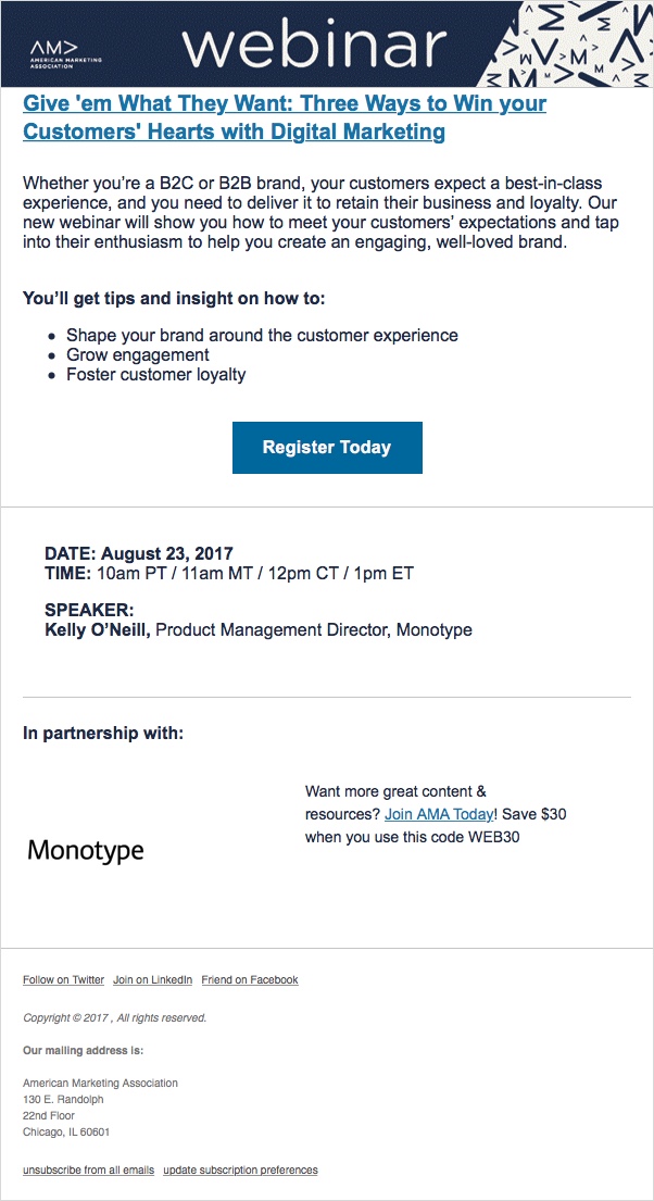
Subject Line Is Interesting But Doesn’t Give Enough Info Without the Preheader
“Give ’em What They Want: Three Ways to Win your Customers’ Hearts with Digital Marketing”
That was the subject line of an AMA email sent to someone who is not an AMA member and unsure about how she got on the organization’s mailing list. It also happens to be the title of a webinar hosted by the AMA, which recipients would realize if they opened the email. Although it’s an interesting and informative webinar title, it doesn’t give recipients enough details about the email message as a standalone subject line.
The subject line is much stronger, however, when combined with the following email preheader: “Complimentary webinar Life Stage Marketing: Audience Targeting from Graduates to Retirees Give ’em What They Want: Three Ways to Win your Customers’ Hearts with Digital Marketing.” Because the preheader is frontloaded with the most relevant information, you know that the email is about a free, life-stage marketing webinar.
Preview Pane Includes the Pertinent Information
The preview pane without images conveys all of the pertinent information contained in the email, including the call to action. But alternative text is not used in the top “webinar” image, which instantly lets recipients know that the email content is about a webinar. So, if recipients don’t download the images, they must read through the text to understand that this email is inviting them to register for a new webinar.
Effective Eye Path and Call to Action
The eye path for this AMA email is effective. The dark-blue header simply includes the AMA logo and the word “webinar,” which is in reverse type and spans the top of the email. From there, the recipient’s attention is drawn to the webinar title in a bold shade of blue typeface, which is congruent with the email subject line.
In the same shade of blue as the headline, the call-to-action button is centered, located in the top fold of the email, prominent, and successfully draws the recipient’s eye. The call-to-action copy—”Register Today” —is also straightforward and likely encourages clicks.
The Offer Is Strong, But the Message Could Be Presented More Clearly
In the first paragraph, the primary message of the email is presented. However, the paragraph is long and gets in the way of the content being accessible. And although the takeaways from the webinar are concisely summarized in 3 bullets, the descriptions are too general. What works well in this email is the way that the webinar details (date, time, and presenter) are succinctly listed below the call-to-action button.
The offer is a strong one: a free webinar on a relevant topic for digital marketers. And the date of the seminar creates built-in urgency. But more could have been done to increase the sense of urgency, such as highlighting the number of days left to register in the subject line, preheader, or call to action.
Overall, this email does the job of getting the word out about a new digital marketing webinar. However, the design of this email is flat, and the benefits need to be more specific to help spark interest. And, except for the “complimentary” reference in the preheader, there’s no mention that this webinar is free. If the subject line had let recipients know from the start that the email was promoting a new, free webinar, more people may have been motivated to open it and convert.
Disclaimer: FulcrumTech does not have access to the performance data relating to this promotional email, so any tests performed on this email can’t be reflected in FulcrumTech’s commentary.