CityEats Philly Email Newsletter Review: Is It a Tasty Treat?

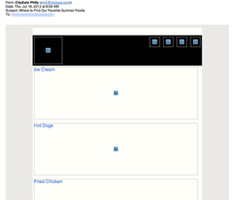
Preview without Images

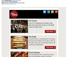
Preview with Images
CityEats Philly Email Newsletter Grade: [A-]
Subject Line | 5 |
Preview Pane | 3 |
Eye Path | 5 |
Clarity of Message | 5 |
Call to Action | 5 |
Offer* | 0 |
Credibility | 5 |
Sense of Urgency* | 0 |
November 30, 2013 —
Organization Overview
Created in collaboration with Food Network, the CityEats Philadelphia website brings all the information consumers want to know about restaurants in the Philadelphia area together with the opportunity to make an online reservation at the hottest spots in town. Details about ambiance, menus, and signature dishes are among the restaurant tidbits CityEats’ website visitors can peruse. In addition to providing information about restaurants in Philadelphia, CityEats also has websites for other cities, including Chicago, Washington, DC, New Orleans, and New York, as well as South Florida.
Sweet Subject Line, But the Preview Pane Could Be a Bit Better
This email was sent to a Philadelphia resident who signed up for the newsletter at the CityEats Philadelphia website. The subject line — “Where to Find Our Favorite Summer Foods” — is a strong one. The recipient sees in the From line that CityEats Philly is the sender and is likely interested in finding out which restaurants are rated among the seasonal favorites.
There’s room for improvement, however, in the preview pane without images. The alternative text used for the images — ice cream, hot dogs, and fried chicken — gives recipients an idea about what’s covered in the newsletter, though it’s not very enticing. Plus, there’s no text in the header, not even a mention of CityEats.
Mouthwatering Eye Path
With a design that’s simple and effective, the eye path in this email newsletter works well. From the CityEats logo in the top left corner, the eye travels to the prominent social media links included in the header, and then down the page to each of the three featured articles. The photos are top notch, including the trendy street shot of an ice cream shop, as well as the mouthwatering food shots.
The copy that describes each of the features is short and sweet — a perfect length to let readers know what they’ll find if they click through. The red call-to-action buttons for each story stand out, while the “Read More” is crystal clear.
Cream-of-the-Crop Credibility
CityEats is building a reputation for being the go-to website when you’re looking for a great dining experience in many of the major U.S. cities. When it comes to advice about where to go and menu reviews, according to this email’s recipient, “They’re always right.” The style and format of this email are consistent with CityEats’ website, and this newsletter does a great job of keeping CityEats top of mind with subscribers.
Disclaimer: FulcrumTech does not have access to the performance data relating to this promotional email, so any tests performed on this email can’t be reflected in FulcrumTech’s commentary.