Deer Park Email: Campaign Loses Steam – and Likely Conversions – Due to the Lack of a Dedicated Landing Page
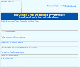
Preview without Images
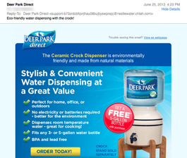
Preview with Images
Deer Park Promotional Email Grade: [B]
Subject Line | 4 |
Preview Pane | 5 |
Eye Path | 5 |
Clarity of Message | 5 |
Call to Action | 5 |
Offer | 5 |
Credibility | 3 |
Sense of Urgency | 1 |
July 12, 2013 —
Company Overview
Deer Park Brand 100% Natural Spring Water (www.deerparkwater.com) is part of Nestlé Waters North America, which began in 1976 as a company that imported Perrier Sparkling Natural Spring Water. In the early eighties, Nestlé Waters North America began adding domestic waters to its product line and has since grown to become the largest bottled water company in the United States. Deer Park joined Nestlé in 1987. According to the Deer Park website, the brand’s natural spring water is collected at the source and “each drop has been screened for 30 times more contaminants than the leading pitcher filter removes.”
Strong Start with an Eco-Friendly Subject Line and Effective Preview Pane
This promotional email from Deer Park starts out strong with a subject line that would likely appeal to the brand’s audience: “Eco-friendly water dispensing with the crock!” In this case, it was sent to Deer Park customers who get water delivered to their homes. Although there is no sense of urgency or offer included in the subject line, it adequately drives interest and intrigue – especially among Deer Park’s environmentally conscious customers – to open the email.
The preview pane without images provides a great example of how to successfully use alternative text: The email message is clear and there’s just enough information to entice subscribers to download the images.
Eye Path, Offer, and Call to Action Work Well Together to “Get the Click”
The eye path is also well designed, taking the reader’s attention from the Deer Park logo in the top left, to the visual of the ceramic crock dispenser, to the red circle announcing the offer of a free 5-gallon bottle of water, to the bright yellow call-to-action button: “Order Today!” Then, below the primary message are photographs of the promoted product in use, as well as various other Deer Park products and accessories.
The email message is presented in a clear and compelling way, the offer is a good one, and the call to action is prominent and effective. Everything in this email works well together to “get the click.” There is no sense of urgency, such as a deadline to take advantage of the offer, which may have helped drive even more clickthroughs.
Lack of Dedicated Landing Page Likely Hurts Conversions and Credibility
All of the interest and excitement about the ceramic crock that the email builds, however, loses steam – and likely conversions – when customers click through. Rather than taking customers to a dedicated landing page with pricing and order information for the ceramic crock, clicking on the “Order Today!” button opens a log in page that requires a user name and password to go any further. So if customers are still interested in the ceramic crock and decide to log in, they are taken to an account summary page that includes information about their next Deer Park water order and delivery. There are some products on this page, as well, but not the ceramic crock. At this point, most customers probably would have lost interest and may even be annoyed.
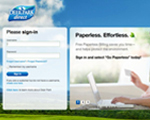
Login Page |
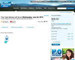
Accounts Page |
Products Page |
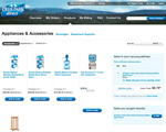
Yet, if customers are still driven to find the ceramic crock and decide to click on the “Products” link at the top of the account summary page, they’ll discover that information about the crock is still difficult to find. Once on the “Products” page, customers must click on the “Appliances & Accessories” link, and then the “Accessories” link, to finally see the cost of the crock dispenser and have the opportunity to purchase it. The Deer Park brand has high credibility, but sending an email with an offer and no easy way to take advantage of it hurts that credibility.
So although this promotional email may “get the click,” we suspect the rate of conversion is low. A dedicated landing page is the gateway to conversion. Integrating email campaigns with specific landing pages helps hold subscribers’ interest and strengthens the email’s marketing message.
Disclaimer: FulcrumTech does not have access to the performance data relating to this promotional email, so any tests performed on this email can’t be reflected in FulcrumTech’s commentary.