eBags Email Review: Is It in the Bag for Getting the Click?

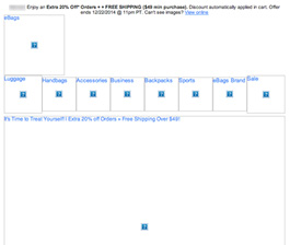
Preview without Images

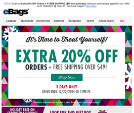
Preview with Images
eBags Email Grade: [C+]
Subject Line | 3 |
Preview Pane | 4 |
Eye Path | 3 |
Clarity of Message | 3 |
Call to Action | 3 |
Offer | 3 |
Credibility | 4 |
Sense of Urgency | 3 |
March 18, 2015 –
Organization Overview
Based in Greenwood Village, CO, eBags is an online retailer of handbags, backpacks, luggage, business bags, and accessories. Customers can currently choose from a selection of over 55,000 bags, representing more than 500 brands that include Samsonite, Nike, Fossil, and Kate Spade. According to the eBags website, the company’s goal is to deliver the bag that’s absolutely right for each customer’s particular journey. Since its founding in 1999, eBags has amassed over 3 million customer reviews and sold more than 22 million bags.
A Lot Is Squeezed into This One Subject Line
This promotional holiday email was sent to an eBags customer who signed up to receive email promotions. The subject line – “Your Holiday Hookup + an Extra 20% Off + Free Shipping!” – lets recipients know about the primary offers contained in the email. The meaning of “holiday hookup” is unclear, however, and there’s a lot of information squeezed into this one subject line. A stronger subject line may have helped to drive more opens.
Although the preview pane without images is long and somewhat “spammy” in appearance, that is the nature of many emails in the eCommerce vertical. Recipients of emails from online merchants such as eBags, for example, are used to getting long email messages that showcase a multitude of product choices and calls to action. In this holiday email, eBags used alt tags effectively to indicate the contents of the image files, as well as pique readers’ curiosity to download images of the featured products.
Both the Eye Path and Email Message Could Be Clearer
The eye path is quite cluttered, starting with the distracting, brightly colored border of triangles located above the fold. Despite the busy border, the “extra 20% off” offer pops successfully. But the multiple free-shipping offers also included are a bit overwhelming:
- “Free shipping over $49!”
- “Holiday rate on expedited shipping!”
- “Look for this gift box to get it before Christmas!”
Furthermore, the headline “It’s Time to Treat Yourself!” and the black banner with “Find the Perfect Bag for You!” are also distracting. Both add clutter and don’t contribute any value to the holiday email message.
eBags personalized this email by using the recipient’s name in the preheader, as well as providing some recommended items, which were based on prior purchases. As we discussed in a previous NewsLever article, personalization pays off with a positive impact on overall transaction rates of email campaigns. In this case, however, the personalized product selection would have had more of an impact if it had been featured closer to the top of the email.
Multiple Calls to Action Provide Ample Opportunities to Convert
When it comes to calls to action, this email offers recipients multiple opportunities to convert throughout the entire email. The first and primary call-to-action button would stand out more if it had been made a different color than the “extra 20% off” offer above it. The wording – “Shop Now” – is descriptive; however, including a benefit, such as “Shop Now & Save,” may help motivate even more clicks.
In addition, multiple calls to action are also conveniently included under each bag/brand highlighted. From a design perspective, consistent treatment of those calls to action would be more effective.
Sense of Urgency Is There, But Easily Missed
There is a sense of urgency in this email – the offer is good for 3 days only. But it isn’t highlighted effective in the copy or design to really motivate recipients to take action immediately. Given the amount of copy and numerous offers, the deadline could be easily missed.
As a large and successful online retailer that carries an extensive line of quality bags, eBags has high credibility. Overall, this holiday email did a good job of showcasing its product line and promoting an enticing holiday discount offer.
Disclaimer: FulcrumTech does not have access to the performance data relating to this promotional email, so any tests performed on this email can’t be reflected in FulcrumTech’s commentary.