Frox Email: Is It Styling or a Fashion Faux Pas?

Preview without Images

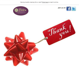
Preview with Images
Frox Philly Email Newsletter Grade: [C]
Subject Line | 1 |
Preview Pane | 2 |
Eye Path | 2 |
Clarity of Message | 2 |
Call to Action | 1 |
Offer | 5 |
Credibility | 3 |
Sense of Urgency | 3 |
January 10, 2014 —
Organization Overview
Frox is a “fun and funky” clothing and accessories boutique with locations in Perkasie and Ambler, PA. Work to weekend outfits, mix and match separates, and easy fit are Frox’s specialties. According to the store’s website, Frox’s goal is to help women find the right clothes for their unique shapes, to look and feel good in every setting. Shopping at Frox is described as a unique experience — a sort of “retail therapy” — with customers leaving the store feeling better than when they came in.
Subject Line and Preview Pane Don’t Incentivize Recipients
“We couldn’t do it without you!!!” That was the subject line of this promotional email sent to a Frox customer who had signed up during a store visit to receive emails. Although the subject line expresses a nice sentiment, it provides no incentive for recipients to open the email. In fact, this recipient had deleted the email before even opening it. A friend (and fellow Frox shopper) asked the recipient if she had gotten a $15 Frox gift certificate, which prompted a search of the trash folder to retrieve the email.
This email had been sent in early December — an especially important time for senders to find ways to cut through the holiday inbox clutter with subject lines that drive opens. In this case, if the recipient had known from the subject line that there was a gift certificate included, she would have opened the email.
The preview pane without images for this email is weak, as well. No alternative text was used in the images to entice recipients to download them. Plus, the images take up too much “real estate” in the preview pane. As a result, the information about the $15 gift certificate is located so far below the fold in the preview pane that recipients must scroll down to see it.
Eye Path and Call to Action Fall Short
The eye path of an email should effectively lead a recipient’s attention to the call to action. In this email, the message begins with a headline that mimics the subject line, but it doesn’t tell recipients what’s in it for them or grab their attention. A more effective headline, for example, would include the $15 gift certificate offer.
The $15 offer does “pop,” as it’s positioned in the center of the email and in red print. To redeem the gift certificate, recipients must print the email and take it into the store. That should be the call to action. Yet the line, “Simply print this email and bring to Frox,” doesn’t stand out at all and just blends in with the rest of the email copy.
Strong Offer, But the Sense of Urgency Could Be Presented More Effectively
The offer is a great one: $15 off everything in the store. Since the coupon could be used only during the month of December, there was also a sense of urgency. That sense of urgency, however, could have been presented in a more prominent way to help motivate people to visit the store and redeem the coupon. It could have been accomplished, for example, by including the end of December deadline in both the subject line and headline.
Frox has a large and loyal local base of shoppers and, thus, high credibility with their regular customers. But if this email was sent to someone who had visited the boutique only once, the recipient might not recognize the store name right away. Having a photograph of the store, or even the store addresses positioned higher in the email, might help people remember their visit to Frox. And again, featuring the $15 gift certificate incentive in the subject line also would help motivate people to open an email, even if they didn’t instantly recognize the name of the store in the From line.
Disclaimer: FulcrumTech does not have access to the performance data relating to this promotional email, so any tests performed on this email can’t be reflected in FulcrumTech’s commentary.