HOW DesignCasts Email: A Good Reminder of the Need to Proofread Before Hitting Send

Preview without Images

Preview with Images
HOW DesignCasts Email Grade: D
Subject Line | 1 |
Preview Pane | 4 |
Eye Path | 2 |
Clarity of Message | 3 |
Call to Action | 3 |
Offer | 3 |
Credibility | 5 |
Sense of Urgency | 5 |
9/11/12 —
Company Overview
What began as a magazine for graphic designers, the HOW (http://www.howdesign.com/) brand has evolved to now offer a variety of products and events to serve the business, creativity, and technology needs of the graphic design industry. This email was a second one regarding the online tutorial for tablet design sent to a subscriber who had signed up for another HOW design tutorial. We can assume that this target audience mostly comprises graphic designers and professionals working in a related field.
Proofread, Proofread, Proofread!
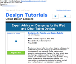
The user experience for this promotional email is off to a tough start with a subject line that reads “tbd.” We know such issues can happen to the best of us, but this is a great example of why every part of the email needs to be proofread before hitting send. Because once it’s sent, it’s sent.
Things turn around, however, once users take a look at the preview page, which provides all of the pertinent information contained in the email with images. The headline, the main offer, and the call to action are all included. In addition, the alternate text — “Designing for Tablets” — is visible in the email’s primary image.
A Stronger Eye Path Needed
The eye path in the email could have been much stronger. The call to action — “Register Now” — is clearly stated and uses bright green in the background of the button. It may have been more effective, however, if centered or positioned on the right to better follow the readers’ eye path. In other words, the call to action has the right words, but it’s likely not in the best location. Given the density of copy in the email, we also recommend a second call to action to help make clicking through to the registration landing page easy.
The overall message and offer in this email are clear. And, even though the date and time of the tutorial are included, there’s no sense of urgency to respond. Creating a deadline for registration or an incentive to register by a certain date, for example, may help to drive more recipients to respond more quickly.
A Copy-Heavy Design
As far as the amount of copy is concerned, there’s too much. The purpose of this email is to get people to click through to the registration landing page. When recipients do click through, the same information is rehashed. So simply putting the key benefits of the offer/tutorial in the email would have been far more effective from a design standpoint. Plus, the additional books for sale at the bottom of the email are distracting from the main message. Again, showing fewer choices and taking users to a landing page with the complete listing of publications offered would have created a cleaner, more effective design.
Credibility Is Questionable
This email’s subject line, other typos within the email copy, and the weak design certainly raise credibility questions — especially considering the purpose and audience of this message. This email example provides an important reminder to all of us in email marketing of the great need for quality control in every piece of correspondence we send to our lists of subscribers.
Disclaimer: FulcrumTech does not have access to the performance data relating to this promotional email, so any tests performed on this email can’t be reflected in FulcrumTech’s commentary.