Ibotta Email Review: Does this welcome campaign fit the bill?
Ibotta Email Grade: [C]
Subject Line | 5 |
Preview Pane | 4 |
Eye Path | 4 |
Clarity of Message | 2 |
Call to Action | 2 |
Offer | 2 |
Credibility | 3 |
Sense of Urgency | 2 |
Email grades are based on a 5-point scale: A = 5, B = 4, C = 3, D = 2, F = 1
December 1, 2015 –
Organization Overview
Founded in 2011, Ibotta is a technology company that came up with a way to connect brands, retailers, and consumers through mobile technology. The Ibotta mobile savings app helps shoppers get cash back on the products they buy. Essentially, it’s a paperless coupon program that lets shoppers use their smartphones to save.
The way it works is that shoppers buy the products they want in one of more than 160 supported stores in the Ibotta network. These stores include such retailers as Walmart, Target, CVS, Best Buy, Weis Markets, and many more. Then, shoppers verify their purchases by scanning the product barcodes and submitting a photo of their receipt. Within 48 hours, cash rebates are deposited into their Ibotta account. The Ibotta website tracks in real time how much money users have earned in cash-back rewards, which has already topped $43 million.
Welcome Series’ Strong Subject Lines Foster Engagement
This welcome campaign was sent to someone who had heard about Ibotta from a friend and downloaded the company’s mobile savings app on her smartphone. The following are the subject lines for the welcome email series, which was sent over a period of 10 days:
- Email #1: “A warm welcome from Ibotta’s CEO.”
- Email #2: “Hi Karen! Time to start earning!”
- Email #3: “Hey Karen! Here’s even more ways to earn.”
- Email #4: “Karen, get your $1 welcome bonus!”
As clearly indicated in the first email’s subject line, the welcome series kicks off with a personal welcome from the company’s CEO. The subsequent three emails include subject lines that are personalized by using the recipient’s first name. With copy constructed in a logical progression to foster engagement, these subject lines successfully draw in recipients:
- The subject line of Email #2 indicates that it contains information about how to start earning rebates
- Email #3’s subject line says that there are additional ways to save
- The final email’s subject line includes an incentive offer.
Compared to the Series as a Whole, the First Email Underwhelms
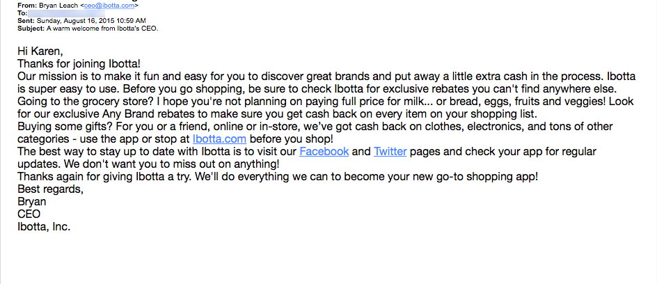
Upon opening the emails, there’s a stark contrast between the first email and the rest of the series. The first email has a great strategy — a one-to-one welcome sent and signed by Ibotta’s CEO. Plus, the email message is personalized and written in a friendly, conversational tone. But a major drawback is that it’s a plain text email without any branding. In addition, the design is simply a solid block of copy that doesn’t allow recipients to quickly scan the information. That means they must read the entire email to understand what it’s about. Compared to the branded and well-designed HTML-formatted email messages that follow, the first email is underwhelming.
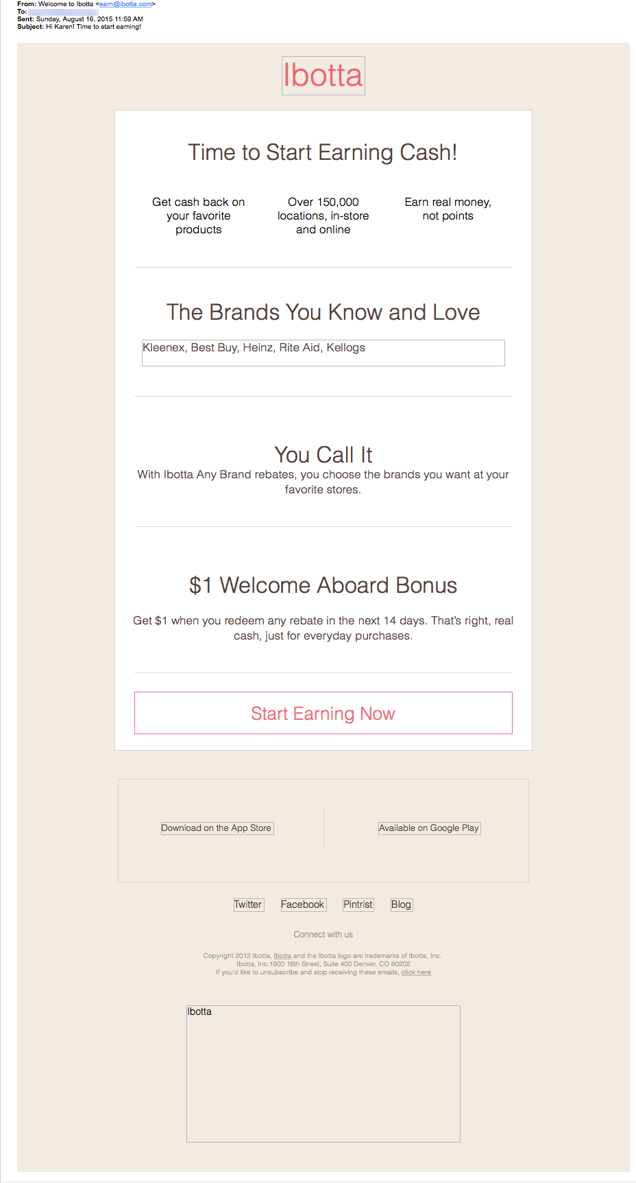
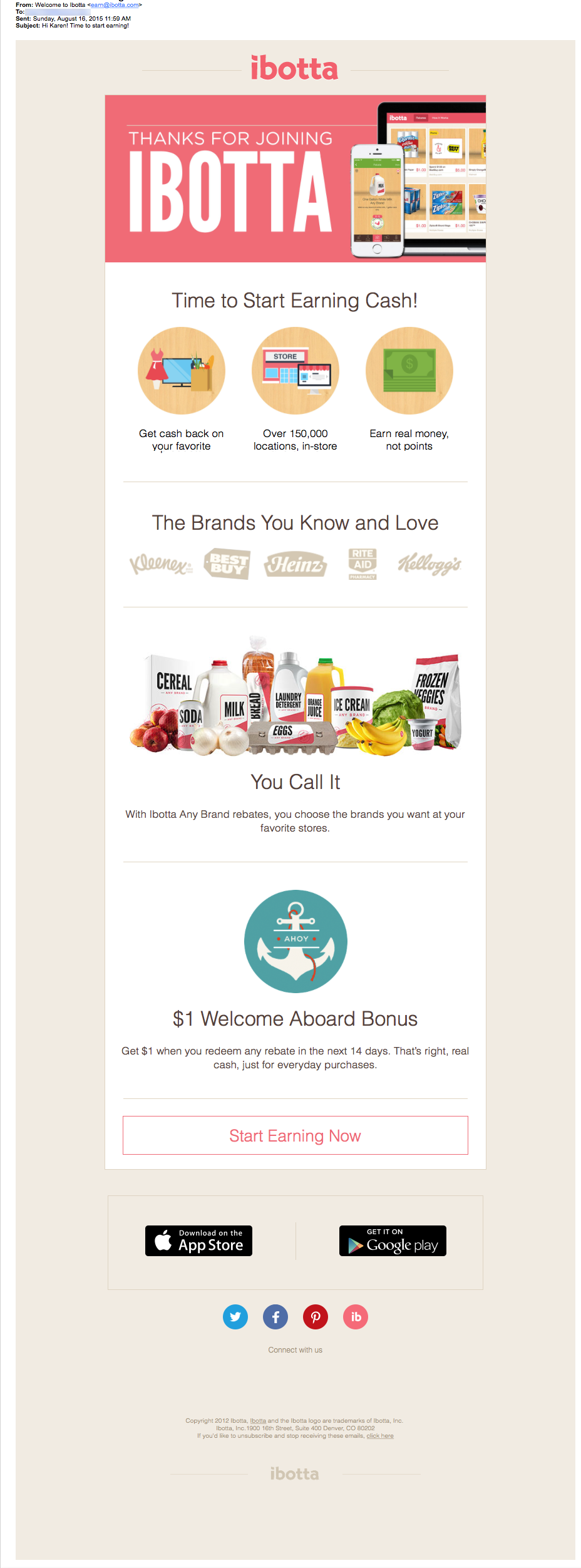
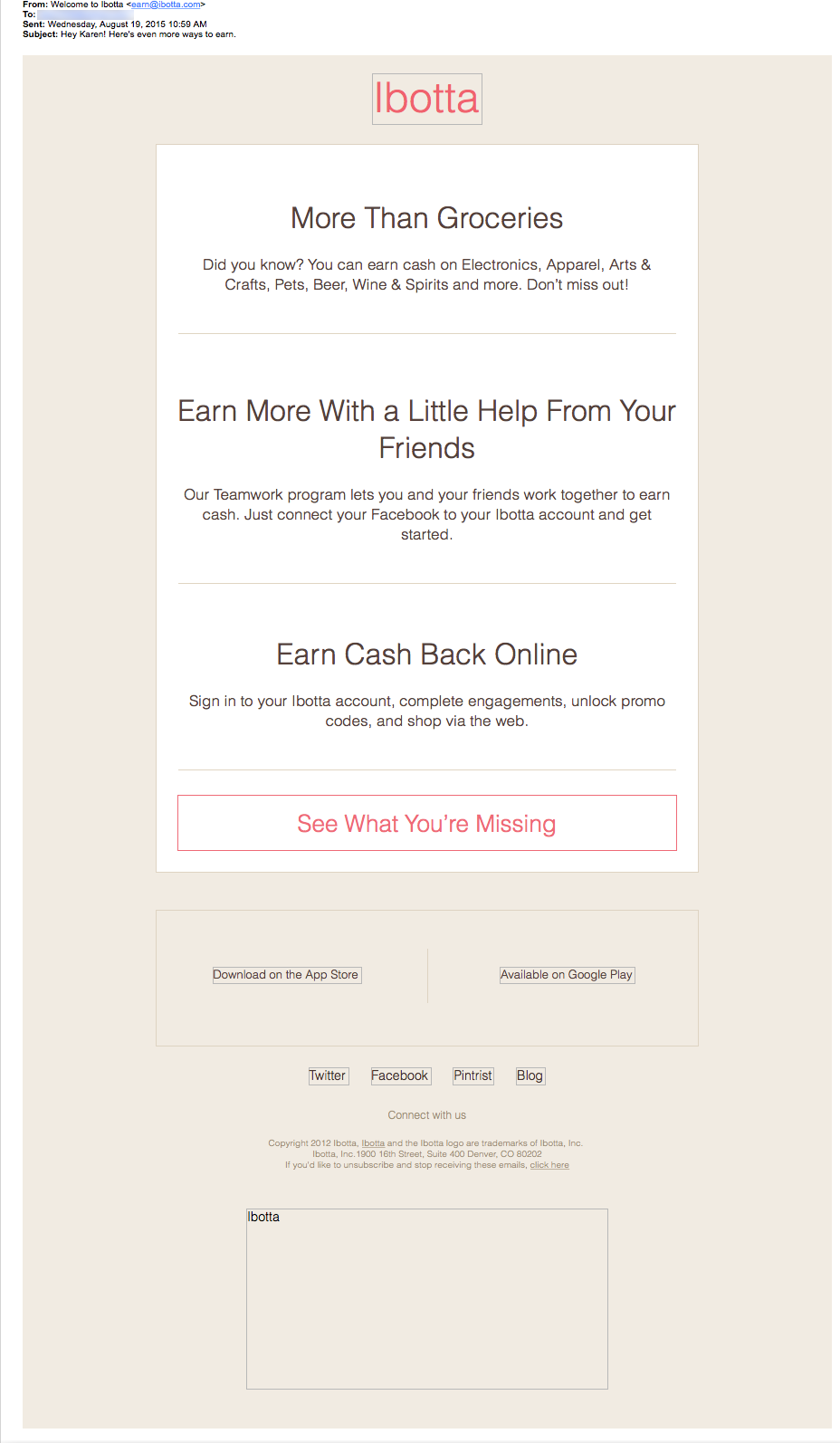
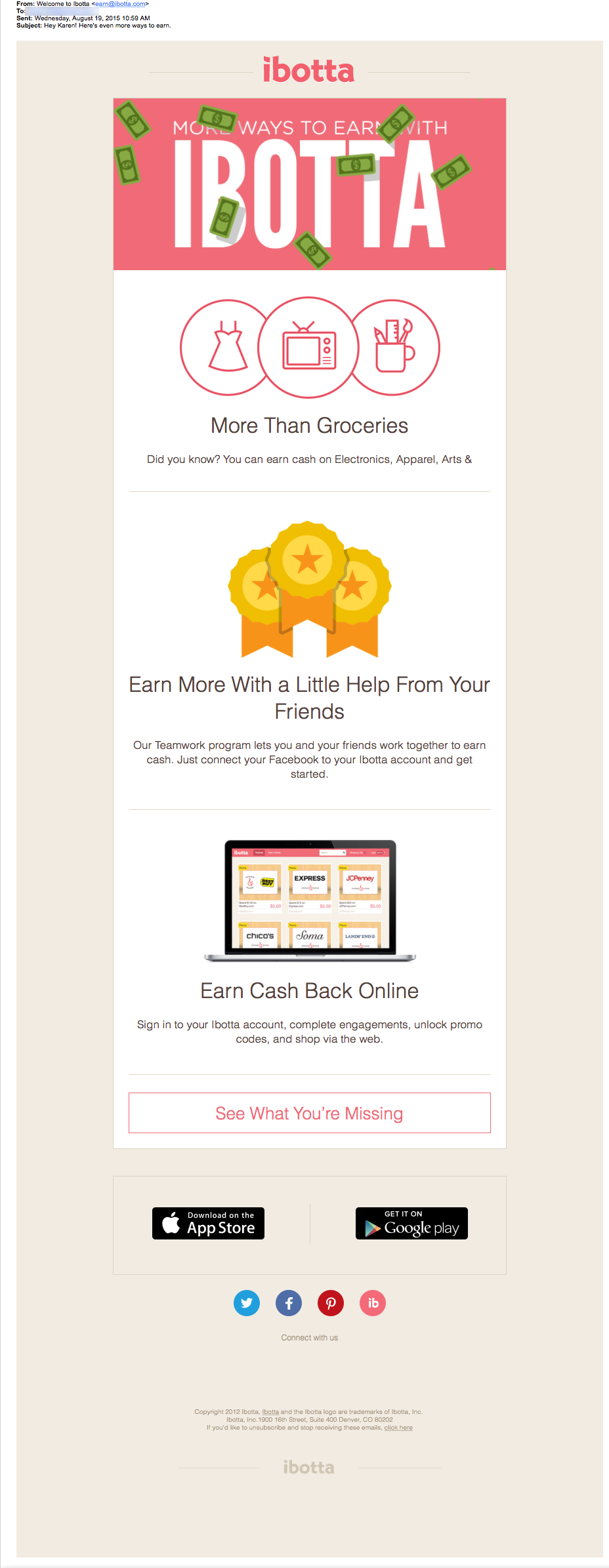
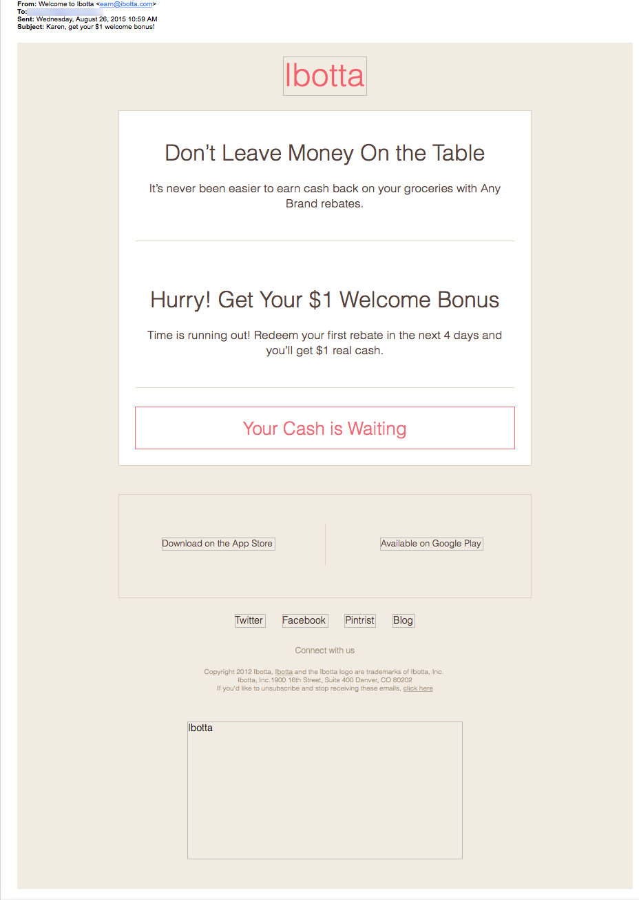
For recipients who view the emails with images blocked, the preview panes do a fine job of conveying the primary message through the effective use of alternative text. And thanks to a simple and clean design, the eye path in all three HTML emails effectively leads recipients’ attention to the call to action.
Some other strong features of these email designs include logos of top brands that we all “know and love” in Email #2, which successfully showcases the Ibotta app’s value. And in Email #3, an animated GIF of money raining down is aptly used to capture attention.
Calls to Action Are Evocative But Could Be More Plentiful and Prominent
The copy on the call-to-action buttons is evocative and encourages the click:
- Email #2: “Start Earning Now”
- Email #3: “See What You’re Missing”
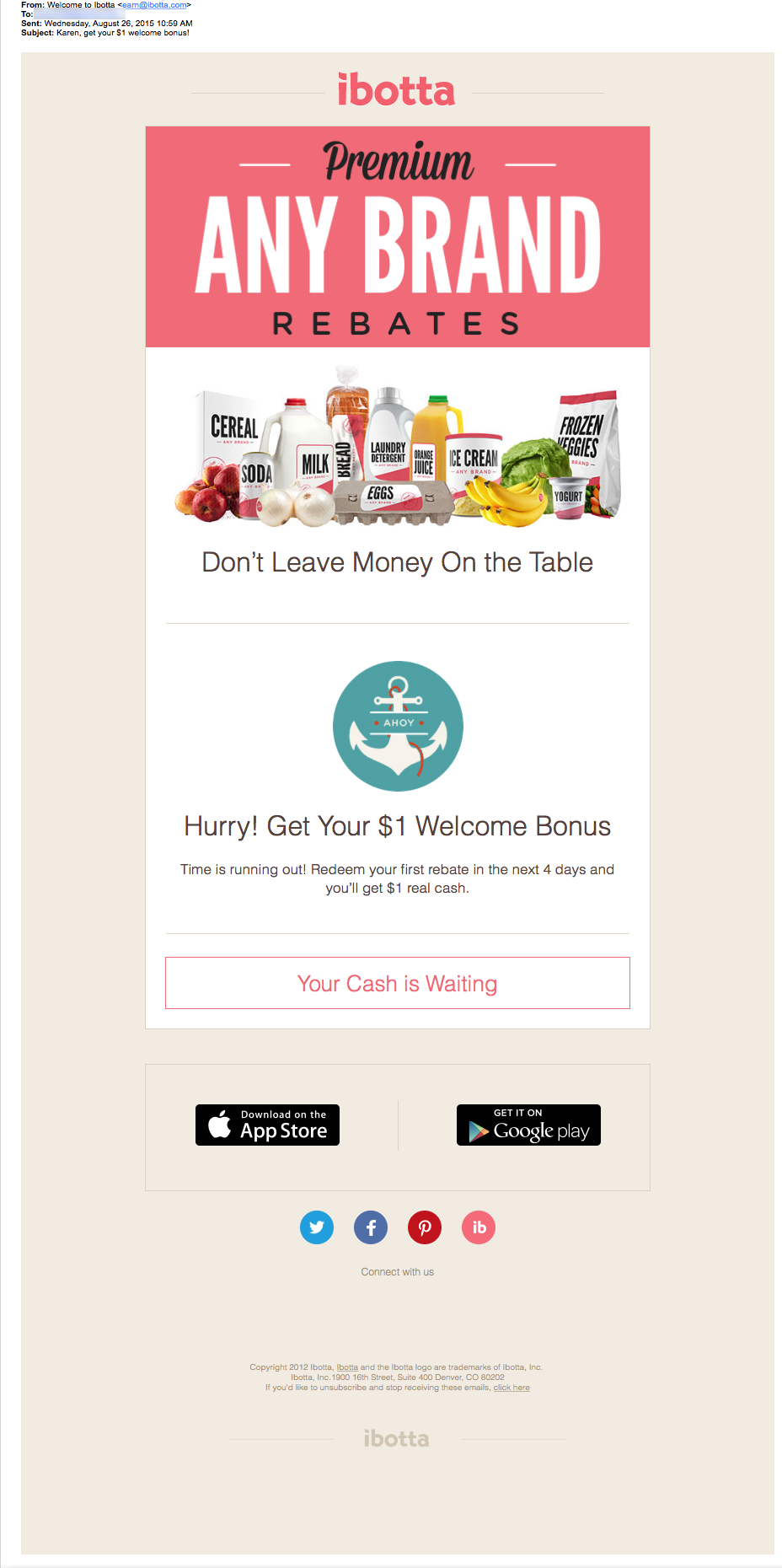
- Email #4: “Your Cash is Waiting”
The only clickable copy in the body of Emails #2, #3, and #4, however, is the call-to-action buttons. And because they’re located near the bottom of the message, recipients must scroll down to view them. In addition, the call-to-action buttons’ colors and design blend in with the rest of the email message. Perhaps a bolder color for the call-to-action buttons, additional calls to action above the fold, as well as more clickable copy within the emails likely would have helped to drive more clicks.
The message of this welcome campaign is not completely clear. The current email content doesn’t adequately explain how to use the Ibotta app or provide a compelling reason why recipients should click the calls to action. Even if recipients click through, they’re taken to a page with a list of rebates, rather than given specific information about how the app actually works.
Will a $1 Incentive Motivate Clicks?
The incentive offer presented in Email #4 — “$1 Welcome Aboard Bonus” — doesn’t provide much motivation for people to try the app. And though recipients are told they have only 14 days to use the app and get the bonus, there’s not a strong sense of urgency created because there’s not much to lose if they don’t claim the dollar.
In this welcome series, a message from the CEO, a list of recognized brands participating in the program, and icons for the Apple App Store and Google Play all contribute to Ibotta’s credibility. Testimonials from satisfied users would help build additional credibility.
A mobile app that streamlines the coupon process is a great idea. And Ibotta seems to be doing it right, given the growing number of participating big brands, store chains, and consumers We’ve identified a few elements in the company’s welcome series, however, that, with some testing and optimization, would likely make it an even more effective campaign.
Disclaimer: FulcrumTech does not have access to the performance data relating to this promotional email, so any tests performed on this email can’t be reflected in FulcrumTech’s commentary.
