InsideHook Email Review: Does it hook subscribers into taking a survey?

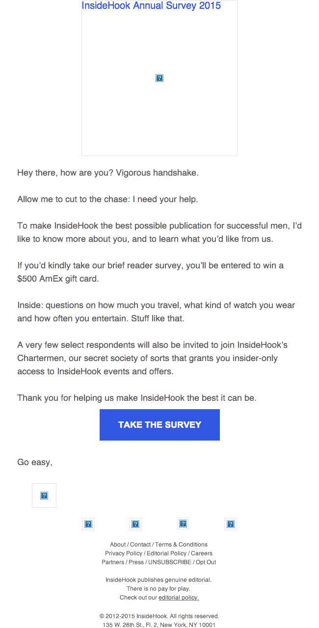
Preview without Images

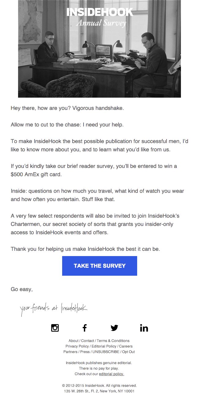
Preview with Images
InsideHook Email Grade: [D+]
Subject Line | 1 |
Preview Pane | 4 |
Eye Path | 2 |
Clarity of Message | 2 |
Call to Action | 3 |
Offer | 4 |
Credibility | 1 |
Sense of Urgency | 1 |
June 2, 2015 –
Organization Overview
Launched in March 2012 by Trigger Media, InsideHook is an email publication that, according to its website, “inspires driven men – guys who have limited time, but discerning taste and a thirst for experiences.” Five editions are published each weekday – New York, Los Angeles, San Francisco, Chicago, and Nation – that feature a single story about such topics as travel, style, food and drink, technology, and outdoor adventures.
Subject Line Comes Off as a Bit Spammy
The subject line of this email – “hey man what’s up?” – comes off as a bit spammy. Perhaps InsideHook was hoping to emulate the most popular email subject line in President Obama’s 2012 reelection campaign, which was “hey.” But considering that the email recipient in this case is female, the subject line is especially inappropriate.
The preview pane without images is effective. In addition to including alternative text to label the image box – “InsideHook Annual Survey 2015” – the bright blue call-to-action button pops and makes it obvious where recipients should click to take the survey.
Offer Is Good, But Not Used Effectively to Help Get the Click
The eye path in this email, however, is weak. Although the headline (“InsideHook Annual Survey”) lets recipients know the purpose of the email, the white font that’s used is easily lost within the black and white photograph. In addition, there are no subheads or bold copy to help people quickly scan the copy or motivate them to take the survey. Recipients must take time to read all of the email copy to determine what the survey is for and why they should participate.
The call to action – “Take the Survey” – is prominent and clear, but it doesn’t provide any motivation for recipients to click through. For example, if the offer to be entered in a drawing to win a $500 American Express gift card had been promoted in the call to action, more subscribers may have clicked through to participate in the survey. There is also no deadline for completing the survey. Again, a sense of urgency may have helped to incentivize more people to convert.
Credibility Is Lacking in This Email Message
The credibility of this email is low. The copy indicates that an individual is the sender with such lines as, “Allow me to cut to the chase: I need your help.” But the signature is from “your friends at InsideHook.” Featuring a signature from the editor or publisher, for example, would help add some credibility. There’s also no information included to remind subscribers about the benefits of the brand or publication. In addition, the fact that the InsideHook email newsletter is designed for “driven men” brings into question how this female recipient got on the list, as she didn’t sign up to receive it.
Disclaimer: FulcrumTech does not have access to the performance data relating to this promotional email, so any tests performed on this email can’t be reflected in FulcrumTech’s commentary.