join.me Email Review: Does It Need an Upgrade?
Preview without Images

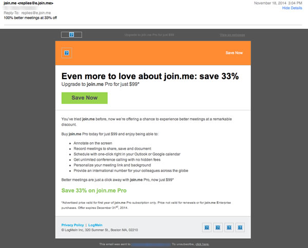
Preview with Images
join.me Email Grade: [C]
Subject Line | 2 |
Preview Pane | 3 |
Eye Path | 4 |
Clarity of Message | 2 |
Call to Action | 4 |
Offer | 3 |
Credibility | 3 |
Sense of Urgency | 2 |
February 19, 2015 –
Organization Overview
The online meeting and collaboration software join.me is a product of the company LogMeIn, Inc. Founded in 2003 and headquartered in Boston, LogMeIn is a provider of SaaS and cloud-based remote connectivity services for IT management, collaboration, and customer engagement. Screen sharing, file transfer, Internet calling, mobile apps, one-click scheduling, and other meeting and marketing tools are available through join.me. According to the join.me website, join.me not only is easy to use, but it also provides the benefit of unlimited audio using Voice over Internet Protocol (VoIP) and dedicated conference lines in more than 40 countries.
Subject Line and Preview Pane Could Be Stronger
This email was sent to a customer who had used the basic join.me software to conduct an online meeting. The purpose of the subject line – “100% meetings at 33% off” – is to convince recipients to open the email and upgrade to the next level of join.me software. The upgrade offer is apparent, however, only after recipients open the email and read the headline and subhead. Not only is the subject line unclear, but also the use of two different percentages creates a competition between the numbers, which diminishes the impact of the 33% off promotion.
The preview pane without images displays everything in the email except the logo. Although recipients who see this version of the email know what the email is all about, there’s no excitement or curiosity created to entice them to turn on the images.
The email content is not well organized in this email promotion. The six bullets of copy appear scrunched together and don’t blend well with the headline and the rest of the copy, which hurts the overall readability of the email message. Based on experience with FulcrumTech clients, we’ve found that limiting the number of bullets in an email to four typically helps drive more conversions.
What Is the Value Proposition?
As far as the call to action goes, there isn’t quite enough “pop.” The large, green call-to-action button draws the recipient’s eye. Plus, the call-to-action copy on the button – “Save Now” – is simple, clear, and user-centric. However, there is no significant benefit associated with the call to action to motivate recipients to click through.
Although “33% off” sounds like a good offer, an offer is only as good as its perceived value. Is it worth the extra money to upgrade from the basic software to the next level of join.me Pro? That question isn’t clearly answered in this email. Testimonials or a money-back guarantee are two possible ways to improve the message clarity, drive more conversions, as well as give a boost to the credibility of the join.me brand in this email message.
A sense of urgency exists in this email, but recipients must read the fine print in the footnote to discover that the offer expires about 6 weeks after the email was sent. Making the offer period shorter and increasing its prominence in the email message also may have helped increase prospects’ interest to convert to the join.me Pro upgrade.
Disclaimer: FulcrumTech does not have access to the performance data relating to this promotional email, so any tests performed on this email can’t be reflected in FulcrumTech’s commentary.