Life is Good Email Review: Does This Welcome Email Give You Good Vibes?
Life is Good Email Grade: [C+]
Subject Line & Preheader | 4 |
Preview Pane | 3 |
Eye Path | 3 |
Clarity of Message | 3 |
Call to Action | 3 |
Offer & Urgency | 3 |
Congruency | 4 |
Email grades are based on a 5-point scale: A = 5, B = 4, C = 3, D = 2, F = 1
September 8, 2017 —
Organization Overview
The Life is Good Company is a “$100 million lifestyle brand dedicated to spreading the power of optimism.” Founded in 1994 and headquartered in Boston, Massachusetts, the company designs, manufactures, and sells apparel and accessories for men, women, children, and babies, including T-shirts, caps, jackets, sleepwear, socks, winter hats, and scarves. Other Life is Good products include collars, leashes, and toys for dogs; mugs; stationery; blankets; and towels.
The company sells its products through about 4,500 retail stores, as well as the Life is Good Web site. To help further the company’s mission of spreading optimism, Life is Good donates 10% of its net profit to kids in need through its Life is Good Kids Foundation.
Subject Line Combined With the Preheader Makes a Strong First Impression
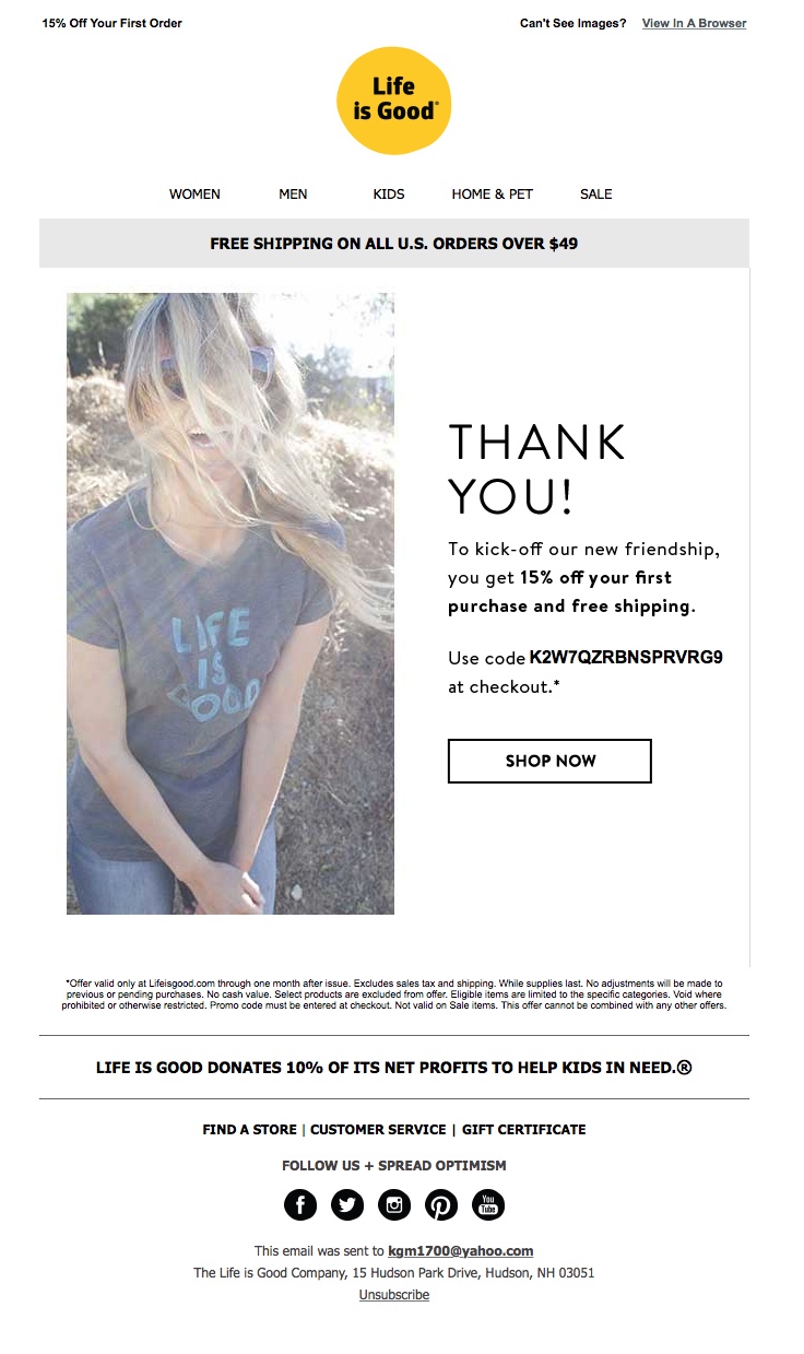
“Good Vibes Coming Your Way!” is the subject line of this welcome email sent to a Life is Good customer and fan who signed up to receive emails from the company through a Facebook promotion. It conveys a nice, positive message that is consistent with the company’s brand. And compared to many subject lines today, this one is relatively short, which will likely help it get noticed in the inbox. Additionally, the total inbox impression is strong, especially when this subject line is combined with the Life is Good sender address and the preheader: “15% Off Your First Order.”
But would putting the discount right up front in the subject line—and not just in the preheader—motivate more people to open the email? Testing this and other subject-line variations is the best way to determine what will resonate most with the Life is Good audience.
The Preview Pane Could Be More Effective and the Message More Clear
The preview pane without images uses alternative text to convey the most important email copy, including the primary 15%-off discount offer and the call to action. The coupon code is just dangling, however, without any explanation of what it is. In addition, the banner with “FREE SHIPPING ON ALL U.S. ORDERS OVER $49” is much more prominent than the 15%-off offer.
Not only does the free-shipping banner stand out more than the primary offer, but it also muddies the overall email message. The email copy states, “To kick off our new friendship, you get 15% off your first purchase and free shipping.” (So, apparently, no matter how much a new customer spends, any first purchase qualifies for free shipping.) It appears that the banner may be part of an email template that was adapted for this welcome email and inadvertently left in.
Another issue with the clarity of message is that, except for the “new friendship” reference, the content doesn’t indicate that this is a welcome email. In fact, the headline, “THANK YOU,” is messaging that would be more consistent with a post-purchase, order-confirmation email. This creates an overall promotional tone, rather than a nurturing welcome to new subscribers.
Image Overpowers Eye Path and the Call-to-Action Button Needs More Pop
The eye path in this welcome email also could be stronger. The image overpowers the email, immediately drawing the reader’s attention away from the copy with the offer, coupon code, and call to action. At least the image is clickable, however, taking users to the Life is Good Web site.
The call-to-action button is a good size, with clear and effective copy: “SHOP NOW.” But adding color, such as the same yellow as in the logo at the top of the email, would likely do a better job of drawing recipients’ attention to the desired action.
The Offer Is Sound, But There Was a Missed Opportunity to Create a Sense of Urgency
The offer—a 15% discount, plus free shipping—is a sound one that may be enough to convince a Life is Good fan to make a purchase. Although there is a deadline for the offer (valid through 1 month after issue), recipients must read the tiny print associated with the coupon code’s asterisk to know about it. Making the offer deadline more prominent in the email copy, and possibly even in the preheader, would help create a sense of urgency and likely drive more clicks and conversions.
Life is Good is an upbeat company with a great reputation for producing high-quality products that brandish optimistic artwork and messaging. The company also takes its mission of spreading optimism a step further by donating a portion of the company’s profits to helping children in need. Although this welcome email does a good job of expressing the company’s mission of positivity, we identified a few improvements to help boost the email clicks and potentially spread more good vibes to even more people.
Disclaimer: FulcrumTech does not have access to the performance data relating to this promotional email, so any tests performed on this email can’t be reflected in FulcrumTech’s commentary.