Musicnotes.com email review: Is this update-your-preferences email pitch perfect? | Email Design Sample

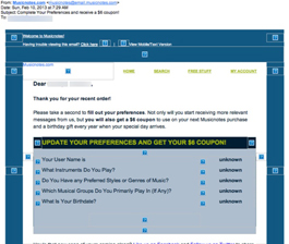
Preview without Images

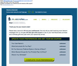
Preview with Images
musicnotes.com Email Grade: B+
Subject Line | 5 |
Preview Pane | 5 |
Eye Path | 5 |
Clarity of Message | 5 |
Call to Action | 5 |
Offer* | 5 |
Credibility | 4 |
Sense of Urgency | 1 |
March 18, 2013 —
Company Overview
Musicnotes.com (http://www.musicnotes.com/) is the leading Internet-based sheet-music retailer and publisher in the world. Based in Madison, WS, Musicnotes.com offers nearly 250,000 pieces of digital sheet music and guitar tablature. According to the company, all of the sheet-music downloads are official and legal and include professional arrangements for all major instruments and skill levels. The sheet music can be downloaded instantly for printing and syncing to the company’s interactive iPad, Android, PC, and web-based applications.
Subject Line Harmonizes Well with Email Message and Offer
This email was sent to a customer who had recently placed a Musicnotes.com order with the goal of getting her to update her subscriber preferences. Like many online companies building an email list, Musicnotes.com requested only the new customer’s name and email address. But now they’re asking for more information, which can be used to segment their email list and create targeted email campaigns.
The subject line — “Complete Your Preferences and receive a $6 coupon!” — clearly communicates the purpose of this email. Plus, the incentive offer of a $6 coupon is right there in the subject line, enticing recipients to open the email.
Eye Path, Preview Pane, and Offer All Hit a High Note
Once recipients click through, the email has a very clean and well-organized eye path. Even if you read just the bolded type and the bright green call-to-action button, the message is still clear. In addition, the preview pane without images contains all of the pertinent information of the email. The $6 coupon offer is a strong one, as $6 buys one or two sheets of music at Musicnotes.com. Both the email’s message and call to action — “Complete Your Preferences” — are quite clear.
Preference Update Process Veers Off-Key
When a recipient clicks through on the call to action, however, the preferences update process design falls short. Recipients must log in to complete their preferences, which was not that easy to figure out and follow through. We suspect that this email generated a high click-through rate but that the metrics declined for those who actually updated their preferences. If this were our client, we would recommend a dedicated landing page that would make the preferences update process quicker and easier for people who clicked through.
The lack of a sense of urgency is a missed opportunity in this email, as well. Setting a deadline to redeem the coupon offer would likely help drive more people to a prompt response.
Disclaimer: FulcrumTech does not have access to the performance data relating to this promotional email, so any tests performed on this email can’t be reflected in FulcrumTech’s commentary.