Nelnet Email: Does It Fit the Bill?

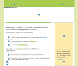
Preview without Images

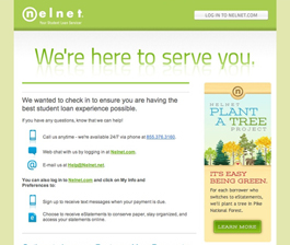
Preview with Images
Nelnet Email Grade: [B]
Subject Line | 5 |
Preview Pane | 4 |
Eye Path | 3 |
Clarity of Message | 4 |
Call to Action | 3 |
*Offer | 0 |
Credibility | 5 |
*Sense of Urgency | 0 |
May 19, 2014 –
Organization Overview
Headquartered in Lincoln, NE, Nelnet is a lending corporation that handles the administration and repayment of student loans. The company provides educational services in servicing loans, processing payments, educational planning, and managing assets. Currently, Nelnet assists more than 5 million borrowers with their student loans and administers tuition payment plans for about 5,500 K-12 schools and colleges and universities.
Subject Line Gets the Job Done
“Questions on paying your student loans? We can help.” This is the subject line of an email sent to a Nelnet customer who currently has a student loan with the company. The subject line clearly communicates the main purpose of the email, which is to tell Nelnet customers that the company is ready and willing to provide help with any issues they’re experiencing with their student loans.
Once recipients open the email, the headline follows through from the subject line to continue the customer-nurturing sentiment: “We’re here to serve you.” Then, below the headline, recipients can find the various ways to contact Nelnet for help.
The preview pane without images effectively uses alternative text in the images to let recipients know the content of the email, even if they don’t download the images. The icon image boxes next to the Nelnet contact information are out of line, however, which detracts from the preview pane’s design and general appearance.
Eye Path and Message Are Clean and Clear
The overall look of the email is clean, and the message is clearly communicated. However, the subhead — “We wanted to check in to ensure you are having the best student loan experience possible.” — could have been bigger. If it were more prominent, the subhead would help balance the headline and draw the recipient’s eye to the primary calls to action. Instead, the eye is first drawn to a competing element on the right side of the email: Nelnet’s “Plant a Tree Project” and the corresponding “Learn More” call-to-action button.
The primary call to action for this email is basically: “If you have a question, ask. And here’s how to contact us.” So making the icons and more of the copy clickable would make this call to action stronger and more effective.
Thanks to This Email, Recipient Feels Nurtured
In this case, the main purpose of the email is to reach out and nurture existing customers, so no offer or sense of urgency are needed. The recipient of this email had a positive response to the email message, which reflects her overall experience thus far with Nelnet, especially in terms of the company’s highly responsive customer service.
Disclaimer: FulcrumTech does not have access to the performance data relating to this promotional email, so any tests performed on this email can’t be reflected in FulcrumTech’s commentary.