Overstock.com Email Review: Is It One of Your Favorites?

Overstock.com Email Grade: [B+]
Subject Line & Preheader | 5 |
Preview Pane | 5 |
Eye Path | 3 |
Clarity of Message | 3 |
Call to Action | 3 |
Offer & Urgency* | 0 |
Congruency | 4 |
*Not applicable
Email grades are based on a 5-point scale: A = 5, B = 4, C = 3, D = 2, F = 1
December 12, 2017 —
Organization Overview
Founded in 1997 and based in Midvale, Utah, Overstock.com, Inc., is an online retailer that sells brand-name, non–brand-name, and closeout products. These products include furniture, home décor, bedding and bath, electronics, apparel, jewelry, health and beauty items, food, books, DVDs, video games, and sporting goods. With approximately 1,800 employees, Overstock.com sells products through its Websites, including www.overstock.com, www.o.co, and www.o.biz. The company typically ships between 2,000 and 5,000 packages per day and as many as 10,000 packages during peak shopping periods. In 2016, Overstock.com reported sales and revenue of $1.8 billion.
Subject Line and Preheader Are Fun and Effective
“Welcome to Your Favorites”
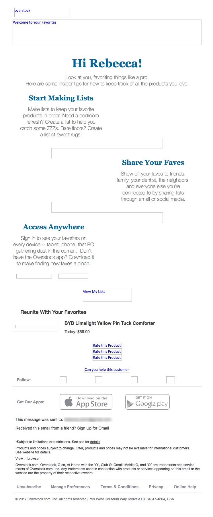
That was the subject line of this nurturing email sent to an Overstock.com customer. It’s a strong subject line that stands out in the inbox, especially when paired with the playful preheader, “Look at you, favoriting things like a pro!” Immediately, the subject line and preheader indicate to the recipient that this email contains personalized information.
The preview pane without images is also strong. It presents all the pertinent information in the email and effectively uses alternative text for the images. In addition, the calls to action are included.
Eye Path Starts Strong, But the Primary Call to Action Is Lost in the Design
The eye path starts out strong, with the Overstock.com logo in the upper left corner and a whimsical red header with reverse type: “WELCOME to your FAVORITES.” In addition to the header copy being congruent with the subject line, it also stands out thanks to the “to your” that is written in script and placed in a deeper-shade-of-red heart. Centered below the header is a prominent and personalized greeting in blue type (“Hi Rebecca”) that captures the attention of the recipient and draws her in.
The eye path flows nicely through the tips that explain how to make lists of Overstock.com favorites and leads the recipient’s attention to the primary call to action (“View My Lists”). However, the call-to-action button is located below the fold and is relatively small compared to the rest of the email’s copy and design.
Located below the primary call to action, 4 additional call-to-action buttons are the same color and nearly the same size as the primary call-to-action button. These secondary calls to action request product reviews and an answer to another customer’s question about a product previously purchased by the recipient. Not only do all of these additional requests for information make the eye path too long, but they also interfere with the clarity of the message.
If the primary call-to-action button was bigger and perhaps a different color (e.g., red), would it pop and get more clicks? Testing variations of the button design is the best way to answer that question. In addition, placing another primary call to action above the fold may also help drive conversions.
Offer and Urgency—A Missed Opportunity
Because this is a nurturing email, it’s not necessary to include an offer and create a sense of urgency. In this email, however, a small photograph of one of the recipient’s favorite products is featured right below the call to action. Plus, a price is listed in tiny, black font: “Today: $69.99.” Is the comforter priced lower than its regular cost? If so, is that special price good only for 1 day? That’s unclear. As a result, Overstock.com missed an opportunity to generate more interest and potentially motivate a sale. A more prominent display of the recipient’s favorite product, as well as a discount coupon, may be just what Rebecca needed to take the plunge and convert.
Overstock.com is a successful online retailer that is highly effective at promoting its brand and products. Overall, this nurturing email is fun and informative; however, we identified a few areas that could be improved to help drive more clicks and conversions.
Disclaimer: FulcrumTech does not have access to the performance data relating to this promotional email, so any tests performed on this email can’t be reflected in FulcrumTech’s commentary.

