PBS Welcome Email: Is This Welcome Email from PBS a Masterpiece?
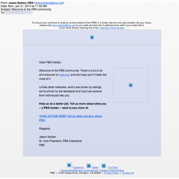
Preview without Images
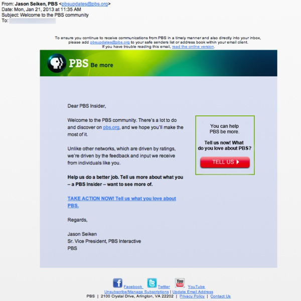
Preview with Images
PBS.org Email Grade: B+
Subject Line | 5 |
Preview Pane | 5 |
Eye Path | 5 |
Clarity of Message | 4 |
Call to Action | 4 |
Offer | 0 |
Credibility | 5 |
Sense of Urgency | 0 |
February 22, 2013 —
Company Overview
Founded in 1969, Public Broadcasting Service (PBS) is a private, nonprofit corporation. Its members are America’s public television stations, including noncommercial, educational licensees that operate more than 350 PBS stations. PBS’s mission is “to create content that educates, informs and inspires.”
Subject Line — Refined Tone Works Well for PBS
This welcome email was sent to a new subscriber who had signed up when she watched a Downton Abbey video at the PBS website. The subject line — “Welcome to the PBS community” — provides a greeting that says it all simply and in a refined tone that one would expect from the PBS brand. In addition, the personalized “from” line affords a nice touch: “Jason Seiken, PBS.” Although most new subscribers may not recognize the name, they’ll see when they open the email that Jason Seiken is the senior vice president of PBS Interactive.
The preview pane without images is also highly effective. All of the pertinent information from the welcome email is visible in the preview pane. Plus, there are just enough missing images to pique recipients’ curiosity and encourage them to download them.
Is the Copy and Call to Action Reader-Centric Enough?
Thanks to a straightforward email design, the eye path is strong, leading from the PBS “Be more” logo to the call to action button to the second call-to-action line in the copy. The message of this email is clear: In addition to welcoming the new subscriber, PBS would like information about what kind of programming their viewers prefer and want to see more of. But perhaps the message could be worded in a way to make the reader feel more central to it. Referring to the subscriber as a “PBS Insider” is a great start. But including more reader-centric phrases that use “you” rather than “we,” “us,” and “our” would likely draw the reader in even more.
The call-to-action button is bright red, which really “pops” in contrast to the muted background colors of the rest of the email. Again, the actual wording on the call-to-action button — “Tell us” — is clear. But making it reader-centric may be more effective, such as “Let your voice be heard.” This would be an interesting variable to test.
Would an Incentive Tied to the Survey Drive More Responses?
When recipients click the call to action, they are taken to a landing page that asks for their email address, first and last names, and a blank form to answer, “What do you love about PBS?” Designed as a way to gather more information about their subscribers, this email may have been more successful in getting people to click through and respond if it was tied to an incentive, such as entering a drawing for a prize. Again, this would be another good thing to test.
Although we’ve suggested some opportunities for testing, we consider this email from PBS a fitting welcome and solid foundation for their email-marketing program.
Disclaimer: FulcrumTech does not have access to the performance data relating to this promotional email, so any tests performed on this email can’t be reflected in our commentary.