Pet Supplies "Plus" Email: Is It the Cat's Meow or Does It Go to the Dogs?

Preview without Images

Preview with Images
Pet Supplies Plus Email Grade: C
Subject Line | 5 |
Preview Pane | 1 |
Eye Path | 3 |
Clarity of Message | 3 |
Call to Action | 2 |
Offer | 2 |
Credibility | 2 |
6/12/12 — Pet Supplies “Plus” is a pet food and supply store chain that aims to provide pet owners with a shopping experience that has supermarket-style value and convenience. In this promotional email sent to a pet owner who signed up for the store’s Preferred Pet Club card, a sale on dog and cat foods is advertised. The email starts off strong with an effective subject line: “7 great deals – up to $25 in savings.” So a savings of $25 is definitely a good incentive to open the email and find out more.
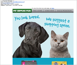
Once the email is opened, a cute dog and cat pair with captions greets the recipient: “You look bored,” says the dog. The cat replies, “We suggest a shopping spree.” We really wanted to like this email. But as we moved past this great first impression and looked more closely at the email, we found some issues that would likely have a negative impact on the campaign results.
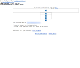
In the preview pane without images, for example, all that recipients can see are boxes with questions marks. That’s because no alternative text was added to the images, which obviously makes the preview pane without images highly ineffective.
The eye path begins well, with the adorable “talking” pets but loses readers along the way to the call to action. Near the bottom of the email, readers also find that sales prices are valid until May 23, about 2 weeks after the email was sent, creating some sense of urgency. Recipients must scroll down through the seven sales items, however, to find this statement, as well as the call to action: “Don’t miss this month’s best deals. Click here to see our sales flyer.”
The call to action itself is clear, but the landing page recipients click through to is where everything this email is trying to accomplish falls apart. First of all, as a recipient of this email, you’d expect to be able to place an online order. This landing page tells you that the online ordering feature has been replaced by being able to view a sales flyer from your local store. Then, the message continues to explain that prices posted in the flyer may vary from store to store and that the sale prices won’t be honored at other stores. Plus, it states that sales prices are good only while supplies last. To get the flyer, recipients must take yet another step by inputting their zip code or state.
This message – both in its content and copy-heavy appearance – creates a feeling of high anxiety for the reader. Although the offer presented in the email is compelling, you begin to wonder if it’s true. This message also hurts the overall credibility of the store: As a customer, you are led to question whether you’ll get any of the products listed for the advertised sales price.
One way to help eliminate the need for this message would be to use personalization. Assuming the email list is made up of customers with Preferred Pet Club cards, the company could determine which store the recipient purchased from and send the appropriate sales flyer.
Disclaimer: FulcrumTech does not have access to the performance data relating to this promotional email, so any tests performed on this email can’t be reflected in FulcrumTech’s commentary.