Rue La La Email: A Welcome Combination of Style and Substance
Preview without Images
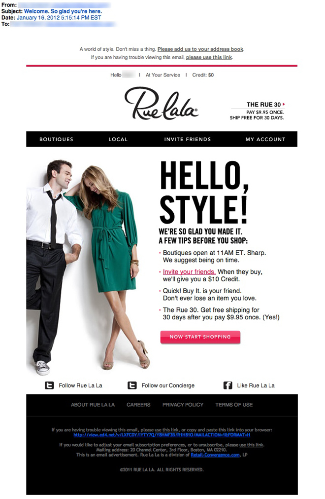
Preview with Images
Rue La La Email Grade: B+
Subject Line | 5 |
Preview Pane | 2 |
Eye Path | 5 |
Clarity of Message | 5 |
Call to Action | 5 |
Offer | 5 |
Sense of Urgency | 3 |
Credibility | 5 |
3/20/12 — Rue La La is an invitation-only shopping (www.ruelala.com) where members can buy from “private sale boutiques” that are open for a short time and offer top brands in fashion, travel, home, gourmet food, wine, and more. We recently reviewed a welcome email from a similar shopping website – Gilt. Compared to Gilt’s welcome email, this one does a better job of introducing the membership benefits to ultimately drive conversions.
Similar to the Gilt email, Rue La La opens with a fitting subject line for its new members, who are expecting a welcome email: “Welcome. So glad you’re here.” But unlike in the Gilt welcome email, both the eye path and clarity of Rue La La’s email message are very strong. Starting at the Rue La La logo, the reader’s eye is effectively led to the fun headline “Hello, Style!” positioned next to a stylish young couple, to a few tips for members before they start shopping, and finally to a prominent primary call to action: “Now Start Shopping.” In addition, the $10 credit incentive to “invite your friends” is presented as a secondary call to action, as it should be in a welcome email.
Another special offer is described in this email: Once shoppers pay $9.95, they’ll get free shipping for 30 days. This offer is tactically included both in the heading and in the tips. To help drive additional conversions, we suggest Rue La La follow up with a trigger email that reminds members not to miss out on the great opportunity to save on shipping costs.
The sense of urgency isn’t strong in this email; however, it’s really not an issue since the purpose of this welcome email is to introduce the benefits of the shopping website to new members. Credibility also isn’t a high priority in a welcome email as it is being sent to people who have already signed up.
For this email, the preview pane without images is the only area that isn’t as effective as it could be. This is especially true in the short preview pane: Because the headline is in such a large font, recipients must scroll down to read the messages that are in tiny print.
Overall, this is a great example of a stylish, well-designed welcome email that successfully communicates how to shop at the website, as well as the advantages and offers associated with membership.
Disclaimer: FulcrumTech does not have access to the performance data relating to this promotional email, so any tests performed on this email can’t be reflected in FulcrumTech’s commentary.