Runner’s World Email: Starts Strong, But Falls Flat

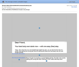
Preview without Images

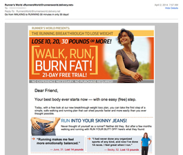
Preview with Images
Runners World Email Grade: [D-]
Subject Line | 4 |
Preview Pane | 1 |
Eye Path | 1 |
Clarity of Message | 1 |
Call to Action | 1 |
Offer | 1 |
Credibility | 1 |
Sense of Urgency | 1 |
July 15, 2014 –
Organization Overview
Runner’s World is a monthly magazine for runners that is published by Rodale Press in Emmaus, Pennsylvania, and distributed worldwide. According to the publication’s website, the magazine had a circulation of 660,000 in 2013, with a total audience of over 3 million readers. As the “world’s leading running magazine,” Runner’s World is designed to inform, advise, and motivate runners of all ages and abilities.
Strong Subject Works with the From Line to Get the Open
This promotional email from Runner’s World was sent to someone who had signed up for a workout program through Women’s Health Magazine, which is another Rodale publication. Apparently, Women’s Health shared this individual’s information with other partner publications, as she had not subscribed to receive emails from Runner’s World. As an avid runner, however, she was familiar with Runner’s World (displayed in the email from line) and intrigued by the email’s subject line – “Go from WALKING to RUNNING 30 minutes in only 30 days!”
But once the recipient opened the email, she felt duped and promptly unsubscribed from further mailings. She quickly assessed that the subject line did not represent the email content, which was a sales promotion for a weight-loss program. Subheads included: “RUN INTO YOUR SKINNY JEANS!” and “RUN SLOWLY, LOSE WEIGHT QUICKLY!” This promotion may appeal to typical Women’s Health readers but likely not to serious runners.
Preview Pane and Overall Design Is Long and Overwhelming
The preview pane without images is very long and overwhelming. No alternative text is used for the images and there’s no call to action located above the fold. If this is all recipients see, there is little incentive to download images or click on any of the links within the copy.
The eye path is also long and confusing with a multitude of links. The photographs have no clear purpose, and the actual terms and conditions of the message and offer are not clear. There are two relatively small orange “Click Here” call-to-action buttons – one positioned near the center of the email and one closer to the bottom. To understand what you get for clicking the call to action requires a lot of reading. Even then, the terms and conditions of the offer are still unclear.
Part of the problem is that too much information is being crammed into this one email message. It appears as though the content may have been developed for a print campaign, and it didn’t translate well for a promotional email or the web. In addition to promoting the “Run Your Butt Off!” program, this email is also trying to educate recipients, which just adds to the confusion of the message. Plus, there’s no incentive or sense of urgency to convince people who may have an interest in the program to click through right away.
Credibility Is Lagging
In an apparent attempt to add credibility, the email is signed at the bottom by Chris Cunningham. Other than indicating Cunningham is associated with Runner’s World Books, recipients probably don’t know who he is since no job title is included.
Runner’s World is a publication that has credibility with runners worldwide. However, the “spammy” appearance of this email hurts that reputation. If Rodale is going to send email messages from partner publications to recipients who signed up through another publication, we suggest that they find out more about recipients’ preferences to help ensure relevant messages are created and sent. Otherwise, recipients likely will unsubscribe – or even worse, report emails as spam – and damage the publisher’s overall sender reputation and deliverability.
Disclaimer: FulcrumTech does not have access to the performance data relating to this promotional email, so any tests performed on this email can’t be reflected in FulcrumTech’s commentary.