Shutterfly Email: Is It Picture Perfect?

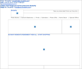
Preview without Images

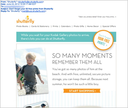
Preview with Images
Shutterfly Email Grade: B
Subject Line | 5 |
Preview Pane | 2 |
Eye Path | 5 |
Clarity of Message | 4 |
Call to Action | 5 |
Offer | 4 |
Sense of Urgency | 1 |
Credibility | 5 |
7/9/12 —
Company Overview
Shutterfly is an online photo service that allows its members to enhance, store, organize, and order prints of their digital photography. In March 2012, Shutterfly purchased Eastman Kodak’s online digital photography website Kodak Gallery.
Target Audience
This promotional email was sent to a former Kodak Gallery user as a follow up to previous emails guiding the transition to Shutterfly.
A Relevant and Timely Subject Line with a Super Offer
“Don’t forget your 50 free prints from Shutterfly” is a highly effective subject line that reminds recipients to take advantage of an incentive offered to previous Kodak Gallery users. In addition to providing a great way to get people to try Shutterfly services, this incentive reminder also comes at a good time – early summer when people tend to take a lot of photos of vacations and family gatherings.
Effective Eye Path
Once recipients open the email, their eyes are drawn from the orange Shutterfly logo in the upper left corner to the circular call to action: “Don’t forget your free prints.” Outlined in orange and on a tilt, this call to action on the far right of the header pops and aligns well with the subject line. Effectively designed, the eye path of this email then pulls the reader’s attention to the photos of children displayed on various Shutterfly products, to a second prominent call to action – “Start shopping.”
Great Use of Trust-Building Content
The credibility of this email is strong, too. In addition to leaning on the Kodak branding in the headline, there’s a “Good Stuff to Know” footer informing people that “Shutterfly securely stores more than 10 billion photos, free of charge, for customers around the world.”
A Better Preview Pane and Improved Sense of Urgency May Help
The preview pane and the sense of urgency are two areas that could have been more effective in this email. If the preview pane without images is all subscribers see, there isn’t much of an incentive to pursue any further action. Although there’s a line of alternative text in the upper right corner that includes, “Order your free prints,” it’s in very small and difficult to read type. In addition, by clicking through the call to action, we discovered that there’s a deadline of July 13, 2012, for free prints. Because that information isn’t included in this email, there’s no sense of urgency to encourage recipients to respond.
A Great Opportunity to Segment to Drive Up Open and Click-Through Rates
The photographs and copy in this email focus on capturing and remembering the moments of a little boy’s life. The recipient of this email happens to have two young sons. Was segmentation used to send an email message with relevant content? We’re not sure – perhaps this email was sent to all previous Kodak Gallery users. But it provides a good example of how knowing more about your customers and using that information to target your marketing message can have a positive impact on email campaign results.
Disclaimer: FulcrumTech does not have access to the performance data relating to this promotional email, so any tests performed on this email can’t be reflected in FulcrumTech’s commentary.