The Grommet Email Review: Is This Welcome Email Engaging Enough?

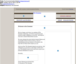
Preview without Images

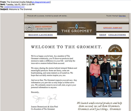
Preview with Images
The Grommet Email Grade: [B-]
Subject Line | 4 |
Preview Pane | 3 |
Eye Path | 3 |
Clarity of Message | 4 |
Call to Action | 3 |
Offer* | * |
Credibility | 5 |
Sense of Urgency* | * |
January 19, 2014 –
Organization Overview
The Grommet is an online marketplace that launches unique, undiscovered products – referred to as “Grommets” – and helps them to succeed. All Grommets have a purpose and are invented by people with stories. Since its start in 2008, The Grommet has launched over 2,000 companies. FitBit and SodaStream, for example, are a couple of highly successful Grommets.
According to The Grommet’s website, the company’s goal is to have 10% of all products that flow through the U.S. retail market coming from independent, small-scale “Makers” within 5 years. The company’s founders believe that this type of business model will help “create vibrant jobs and innovative products in every corner of our country.”
Subject Line & Preview Pane Indicate What the Email Is All About
This welcome email was sent to someone who had signed up to “get Grommets by email” at The Grommet website. So the subject line – “Welcome to The Grommet” – does a good job of letting recipients know that this is an email introducing The Grommet brand. Once the email is opened, the headline matches the subject line and expresses the main point of the email, which is to welcome new subscribers.
There are several blank image spaces in the preview pane without images, which may be enough enticement for recipients to actually download the images. Alternative text is used minimally, however, and doesn’t provide recipients with information about the images or any motivation to download them. Plus, there is no call-to-action link in the preview pane. Instead, subscribers see only a blank image space for the call-to-action button.
Eye Path & Call to Action Could Be Stronger
The header of this email is very busy and competes with the headline and main point of the email. In addition to a free shipping offer for purchases over $50, the header includes links to shop, recent launches, collections, and a “give $10, earn $10 promotion.”
From there, the eye travels to the photograph, and then to three paragraphs of information. Although the copy reads well, a shorter, bulleted version would be more scannable for readers. Also, the third paragraph deals with privacy issues, stating, “We solemnly swear to never give, sell, or rent your personal information to anyone.” Some studies have indicated that this type of statement may actually hurt conversions. It would be interesting to test if that’s true for this audience.
The orange call-to-action button is prominent and really pops in the email design. However, the call-to-action copy – “Start Shopping” – doesn’t quite fit with the rest of the email content, especially since no products are showcased. Perhaps expressing a sentiment similar to “Come Explore” in the call to action may help increase subscribers’ emotional connection with the company and its unique product line.
Since this is a welcome email, an offer and sense of urgency could be included but aren’t necessary. Would including an incentive offer for a limited time – such as free shipping or a percentage off a first purchase from The Grommet – increase open, click-through, and conversion rates? Testing is the best way to find the answer to that question.
Email Does a Great Job of Establishing Credibility
A photograph of the company’s founders helps demonstrate that The Grommet is a company run by real people with a real mission, which helps build credibility. The quote situated below the photo describes The Grommet’s mission; however, from a design standpoint, the quote looks disconnected from the rest of the email.
Overall, this welcome email does a good job of expressing and sharing The Grommet’s brand value with new subscribers.
Disclaimer: FulcrumTech does not have access to the performance data relating to this promotional email, so any tests performed on this email can’t be reflected in FulcrumTech’s commentary.