UncommonGoods Email: How Does This Uncommonly Good Email Cut Through the Inbox Clutter?

Preview without Images

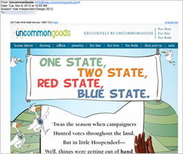
Preview with Images
UncommonGoods Email Grade: B
Subject Line | 4 |
Preview Pane | 2 |
Eye Path | 5 |
Clarity of Message | 5 |
Call to Action | 5 |
Offer | 4 |
Credibility | 5 |
Sense of Urgency | 2 |
12/18/12 —
Company Overview
UncommonGoods (http://www.uncommongoods.com/) is an online store that sells creative and unusual gifts, including jewelry, home decor, art, handmade and recycled items, and clothing. Sustainability and environmental friendliness are top priorities for this company’s business model.
Subject Line and Headline Cleverly Tie into Election Day
Sent on Election Day, this email from UncommonGoods playfully imitates Dr. Seuss’s classic One Fish Two Fish Red Fish Blue Fish. The company uses the headline, “One State, Two State, Red State, Blue State,” to set the tone for a whimsical rhyming tale that highlights seven products from their extensive line of unique gifts.
The subject line — “Vote Independent Design 2012” — is a clever way to connect with the excitement of Election Day and pique subscribers’ curiosity about the contents of the email. Recipients who are familiar with the UncommonGoods brand expect and look forward to an artistic and entertaining message from this company.
Weak Preview Pane in Need of Alt Tags
The preview pane for this email is weak. We appreciate the creative effort UncommonGoods uses to direct viewers to the email with images: “Can’t see what deserves your vote? Click here.” The use of alt tags in the email without images, however, would give recipients an idea of the featured gifts and likely make them want to see more.
Unique Offers and Calls to Action
The eye path is strong, with the story, illustrations, and interspersed photos of products drawing readers’ attention down the page. Similar to the company’s product line, the offers and calls to action in this email are unique. An underlined descriptive word next to a photograph of each of the featured products — that are woven into the Dr. Seuss-inspired election story — encourages people to click through to the UncommonGoods website to find out more.
Then, at the bottom of the email, readers are asked to participate in shaping “the future of UncommonGoods” by voting on whether they’d buy a new product. There’s also a featured artist, along with photos of selected pieces of her jewelry, announced by a big starburst that shouts: “New! Fresh! Wow!” Subscribers know to look for these two sections at the bottom of the email, as they are typically included in UncommonGoods’ promotional messages.
High Credibility, Low Sense of Urgency
Thanks to a strong brand following, the credibility for this company is high. For example, UncommonGoods has over 49,000 likes on Facebook and more than 7,200 followers on Pinterest. The sense of urgency is low in this email, but not every email needs to create urgency. In this case, the timing of the email — just before the holidays — was priming customers to think about gift ideas for the upcoming season.
At FulcrumTech, we are big fans of the creative effort UncommonGoods puts into their email campaigns. This is a great way for a business to build a loyal customer base and cut through the inbox clutter. The entertainment value of the emails is an enticement for subscribers to open them, as well as take a look at the company’s product offerings.
Disclaimer: FulcrumTech does not have access to the performance data relating to this promotional email, so any tests performed on this email can’t be reflected in FulcrumTech’s commentary.