How to Prepare for the New Gmail Promotions Grid-View Format

![]() Thanks to Gmail’s new Pinterest-like, grid-view promotions tab format, email marketers have a bigger and better opportunity to engage with subscribers. But are you prepared to make the most of this latest change from Gmail? Here’s what you need to know.
Thanks to Gmail’s new Pinterest-like, grid-view promotions tab format, email marketers have a bigger and better opportunity to engage with subscribers. But are you prepared to make the most of this latest change from Gmail? Here’s what you need to know.
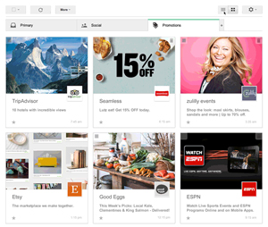
The new Gmail promotions tab format shown above is currently being beta tested and available only to Gmail users who sign up to participate in a field trial. According to a Gmail blog post, this format is designed to help users “view the Promotions tab in a more visual way,” as well as find what they’re looking for faster. Users who are part of the field trial can toggle back and forth between the standard list view and the new grid view by clicking the corresponding view button located at the top of the promotions tab. At this point, the new promotions grid can be viewed on desktops but not mobile devices.
Will Gmail fully implement this new image-rich format? It’s still too early to tell. Considering the current popularity of Pinterest, however, not only is there a good chance the grid view will be part of the Gmail promotions tab future, but also we may see other email inboxes adopting similar formats.
Grid-View Tips to Help Send Your Gmail Open Rates Soaring
In the new grid-view format, the email image comprises the following four parts:
- Featured image
- Subject line
- Sender name
- Logo.
Here are some design tips to help ensure your emails look great in the new grid view and drive up your open, click-through, and conversion rates.
- The featured image must be at least 580 x 480 pixels.
- The image can be in JPEG, PNG, or GIF format. But keep in mind that if you use a GIF, the first frame will appear as a static image.
- Your email’s HTML will need to include specific code if you want to be sure the email image presents properly in the Gmail grid view and that it’s the image you want to display, If your email doesn’t contain the code, Google uses an algorithm to decide which image from your email to feature. Check out the Gmail Developers site for more details about how to specify the featured image that will be used in the new promotion tab grid view, as well as other code samples.
- Be aware that in grid view, up to 75 characters display in the subject line and up to 20 characters for the sender name.
- Google pulls the logo for the grid view from an organization’s verified Google+ profile. So if you don’t have a Google+ profile, now’s the time to set one up (until you do, Google will display the first letter of your sender name in serif font).
- Before sending, always be sure to test that your emails are rendering correctly in the Gmail grid view. This is especially important if you know a large portion of your subscribers are Gmail users.
Need help getting your emails optimized for the new Gmail promotions tab? Email us or give us a call at 215-489-9336 and FulcrumTech’s email experts will show you how it’s done!