Bounce Exchange Email Review: Does It Arouse Interest or Ire?

Preview without Images

Preview with Images
Bounce Exchange Email Grade: [C+]
Subject Line | 3 |
Preview Pane | 2 |
Eye Path | 4 |
Clarity of Message | 3 |
Call to Action | 3 |
Offer | 3 |
Credibility | 4 |
Sense of Urgency | 4 |
Email grades are based on a 5-point scale: A = 5, B = 4, C = 3, D = 2, F = 1
September 10, 2015 –
Organization Overview
Founded in 2010 and headquartered in New York, NY, Bounce Exchange is a full-service behavioral automation platform that is designed to react to the “digital body language” of website visitors. In other words, Bounce Exchange uses software to analyze such visitor behaviors as purchase history, traffic sources, engagement patterns, and the moment a visitor is abandoning a website (using the company’s patented exit-intent technology). Bounce Exchange then uses this information to create a variety of customer acquisition strategies designed to help boost business metrics for their clients.
Subject Line Gets Mixed Reviews From FulcrumTech Panel
This promotional email was sent to an email-marketing professional who had opted in to get emails from Bounce Exchange. The subject line — “[VIP Invitation] Your Lackluster Use of Triggered Emails Is Costing You Millions” — received mixed reviews from the FulcrumTech panel evaluating this email.
Everyone on the panel agreed that bracketing “VIP Invitation” was an effective way to grab a recipient’s attention in the inbox. Some panel members, however, felt that the rest of the message was insulting and triggered defensiveness. Other panel members felt that the subject line was intriguing and would prompt recipients to open the email to see what it was about.
Preview Pane Fails to Incentivize Recipients to Download Images
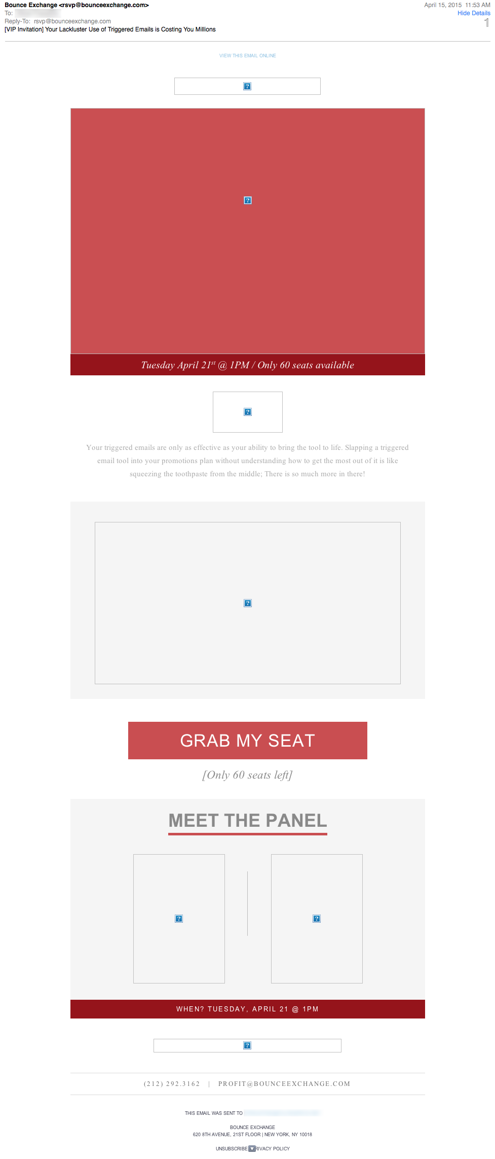
Everyone on the panel agreed that the preview pane without images was weak. No alternative text was used for the images to elucidate the email message or incentivize recipients to download images. Plus, recipients must scroll down to reach the call-to-action button.
Compelling Eye Path, But Message Lacks Clarity
Although the primary call-to-action button was located far down in the layout, the eye path of this email is strong. The design and copy are bold and lead readers to the prominent and distinctive call to action: “GRAB MY SEAT.”
There is a lack of clarity, however, in the messaging of this email. Though the primary goal of this email is to get recipients to sign up for a webinar, the word “webinar” is not mentioned in the email. Instead, the cryptic phrase, “Tune into the digital panel,” is presented in small, easy-to-miss type.
As far as the offer, we assume that the webinar is free to attend because no cost is included. But again, it is unclear. Certain members of the review panel also felt that the tone of some of the copy was aggressive. In addition to the subject line (that is repeated in copy located near the top of the email), a good example is the phrase, “LET’S FIX THIS, STAT.”
Strong and Creative Sense of Urgency
There was a good sense of urgency, which was created by stating that only “60 seats” were left. Plus, the email was sent one week before the webinar was scheduled. Bounce Exchange is building a good reputation in the industry as a cutting-edge firm, so the credibility is also very good for this email. In addition, including the photographs and titles of the Bounce Exchange webinar presenters contributed to the email’s credibility.
Conflicting Views Are Reflected in the Grade Given
The average grade assigned for this email reflects the conflicting views of the FulcrumTech panel. Some argued that the audience for the email consists of email-marketing professionals and that, thus, this type of bold design and creative copy effectively cuts through the clutter of similar emails. Others felt, however, that the unclear message and sometimes-aggressive tone detracted from the effectiveness of the email message.
Disclaimer: FulcrumTech does not have access to the performance data relating to this promotional email, so any tests performed on this email can’t be reflected in FulcrumTech’s commentary.