Amazon Email Review: Is this Cyber Monday series the real deal?
Amazon Cyber Monday Email #1 Grade: [B-]
Subject Line | 4 |
Preview Pane | 2 |
Eye Path | 4 |
Clarity of Message | 3 |
Call to Action | 4 |
Offer | 4 |
Credibility | 5 |
Sense of Urgency | 4 |
Amazon Cyber Monday Email #2 Grade: [C+]
Subject Line | 2 |
Preview Pane | 3 |
Eye Path | 4 |
Clarity of Message | 3 |
Call to Action | 4 |
Offer | 1 |
Credibility | 5 |
Sense of Urgency | 4 |
Email grades are based on a 5-point scale: A = 5, B = 4, C = 3, D = 2, F = 1
January 5, 2016 –
Organization Overview
Headquartered in Seattle, WA, Amazon.com, Inc., is a global e-commerce company and the biggest Internet-based retailer in the United States. The company was founded in 1994 by Jeff Bezos and began as an online bookstore. It later diversified into selling a wide range of products, including CDs, DVDs, video games, electronics and computers, jewelry, clothing, toys, and much more. Amazon also produces and markets such consumer electronics as Kindle e-readers, Fire tablets, and Fire televisions.
One Subject Line Is Stronger Than the Other
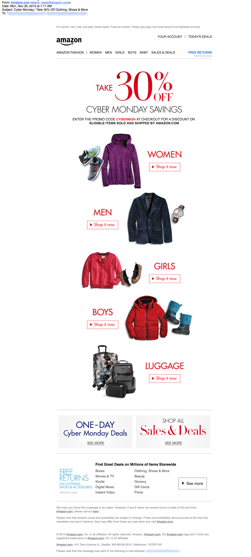
This promotional email series was sent to an Amazon customer on Cyber Monday, with the first email arriving in her inbox at 7:17 a.m. and the second one at 7:38 p.m. The subject line of the first email — “Cyber Monday | Take 30% Off Clothing, Shoes & More” — is strong. It touts a 30% discount offer on clothing and luggage and provides a “carrot” to drive opens with “& More.” Is the 30% discount also applicable to other products, such as toys, electronics, and computers? Recipients may be motivated to open the email to answer that question.
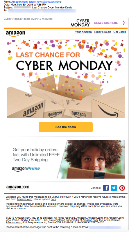
“Last Chance Cyber Monday Deals” is the subject line of the second email in the series. In terms of motivating recipients to open the email, it’s not as strong as email #1’s subject line. It does create some urgency, however, indicating that this is the recipient’s last chance to get Amazon’s Cyber Monday deals. (Amazon actually extended Cyber Monday deals for the entire week following Cyber Monday.)
Preview Panes Could Be More Effective
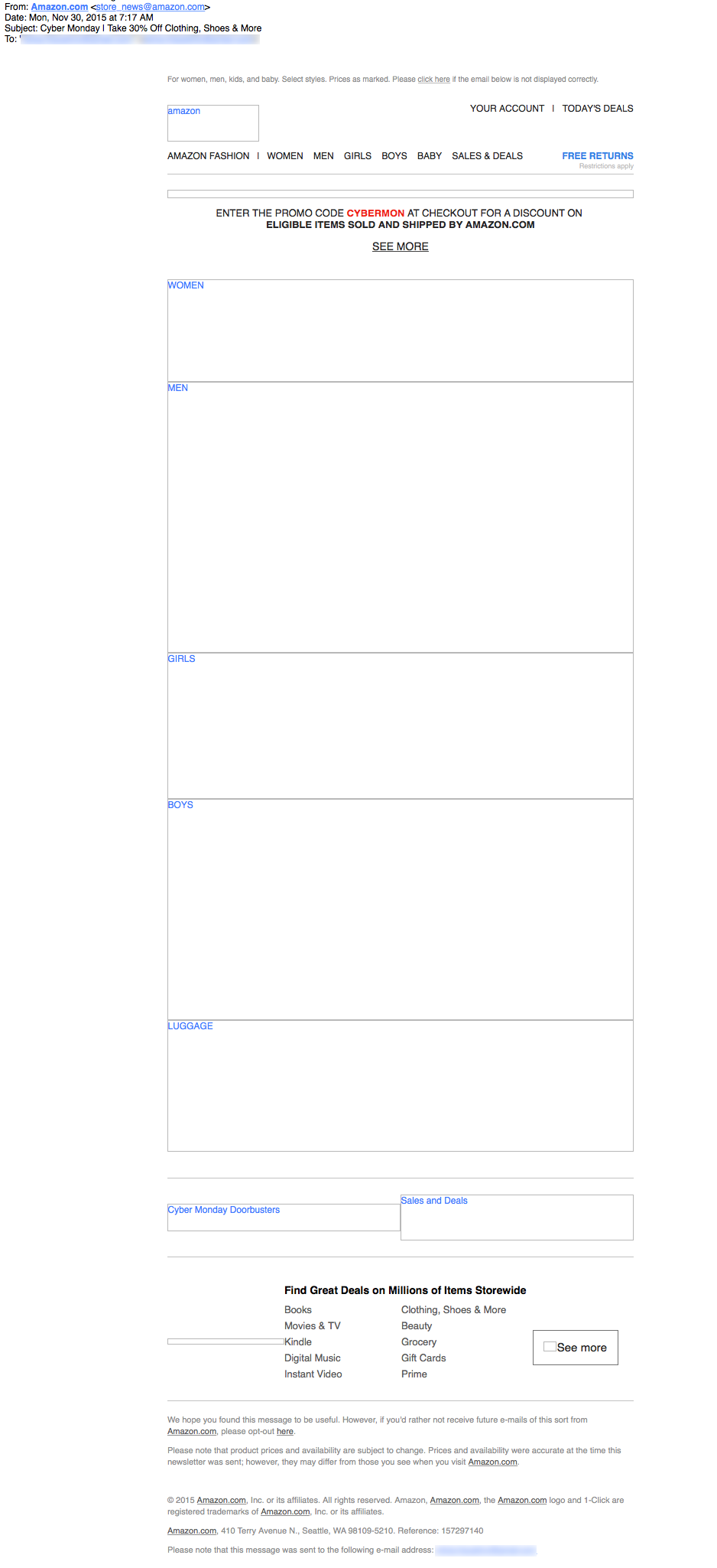
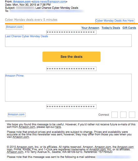
In email #1’s preview pane without images, two of the most important elements of the email message are lacking: the 30% discount offer and the calls to action. Although both emails in the series use alternative text to describe the images, email #2’s preview pane is more effective. In addition to including the primary call to action, email #2 also does a better job of providing the right amount of descriptive copy in the alternative text to entice recipients to download the images. Additional details about the deals available, however, would make this an even more effective preview pane and overall email message.
Eye Paths Are Good, But the Email Message Could Be Clearer
In both email #1 and email #2, the eye paths successfully lead recipients’ attention to the primary calls to action. The message of this email series, however, is not as clear as it could be. In the first email, the call-to-action buttons associated with each product category are prominent and display the active and descriptive copy: “Shop it now.” It’s also clear that recipients need to enter the promo code “CYBERMON” at checkout to get their discount. But then there are two additional calls to action below the products: “ONE-DAY Cyber Monday Deals” and “Shop All Sales & Deals.” So how are the one-day deals different from the ones described above, and when do all of them expire? In this case, these additional calls to action weaken the primary call to action, “Shop it now.”
Generic Design Looks More Like a Birthday Email Than One for Cyber Monday
Similarly, in the second email, the ad for AmazonPrime detracts from the primary call to action, “See the deals.” Thanks to the image and the colors used in design, this email looks more like a birthday message than one for Cyber Monday. Both email messages lack personalization and appear to have been sent as a blanket emails to Amazon customers.
In terms of a sense of urgency, there is an implied one because these deals are supposedly limited to Cyber Monday. But having a statement clarifying that the discounts are available for only one day would likely help drive more conversions. In addition, email #2 could have reminded recipients that they had only hours to take advantage of the Cyber Monday deals, assuming the discounts ended at midnight. A dynamic image counting down the time left to take advantage of Cyber Monday specials, for example, would be a powerful way to create urgency.
Amazon Brand Is Highly Credible and Sets the Bar for Email-Marketing Success
Amazon is a huge, well-recognized brand with a great reputation in the e-commerce market, so the credibility of these emails is high. When it comes to email marketing, this company is effective and sets the bar for success. We found a few elements in this Cyber Monday email series, however, that, with some testing and optimization, may yield even better performance results.
Disclaimer: FulcrumTech does not have access to the performance data relating to this promotional email, so any tests performed on this email can’t be reflected in FulcrumTech’s commentary.


