BarkBox Abandoned-Cart Email Review: All Bark and No Bite?
Return Path Email Grade [C]
Subject Line | 2 |
Preview Pane | 1 |
Eye Path | 3 |
Clarity of Message | 4 |
Call to Action | 4 |
Offer* | 4 |
Credibility | 4 |
Sense of Urgency* | 1 |
*Not applicable.
Email grades are based on a 5-point scale: A = 5, B = 4, C = 3, D = 2, F = 1
July 6, 2016 –
Organization Overview
Founded in 2011, BarkBox is the flagship product of Bark & Co., a provider of pet-themed products and technology based in New York, New York. BarkBox is an e-commerce subscription service that sends a selection of four to six items each month, such as dog toys, treats, and accessories, that are pet-designed dental and health products. One-, three-, six-, and 12-month subscriptions are available, and 10% of BarkBox proceeds go to animal shelters, rescues, and welfare organizations.
Bark & Co. also operates BarkPost (a dog-themed content site), BarkCam (a photo-sharing app), and BarkBuddy (a “Tinder for dogs”).
Subject Lines Could Be Stronger
This abandoned-cart email series was sent to a dog owner who had clicked on a Facebook ad and started the process of purchasing a BarkBox subscription. The following are the subject lines of the three emails in the series that she received over a period of four days:
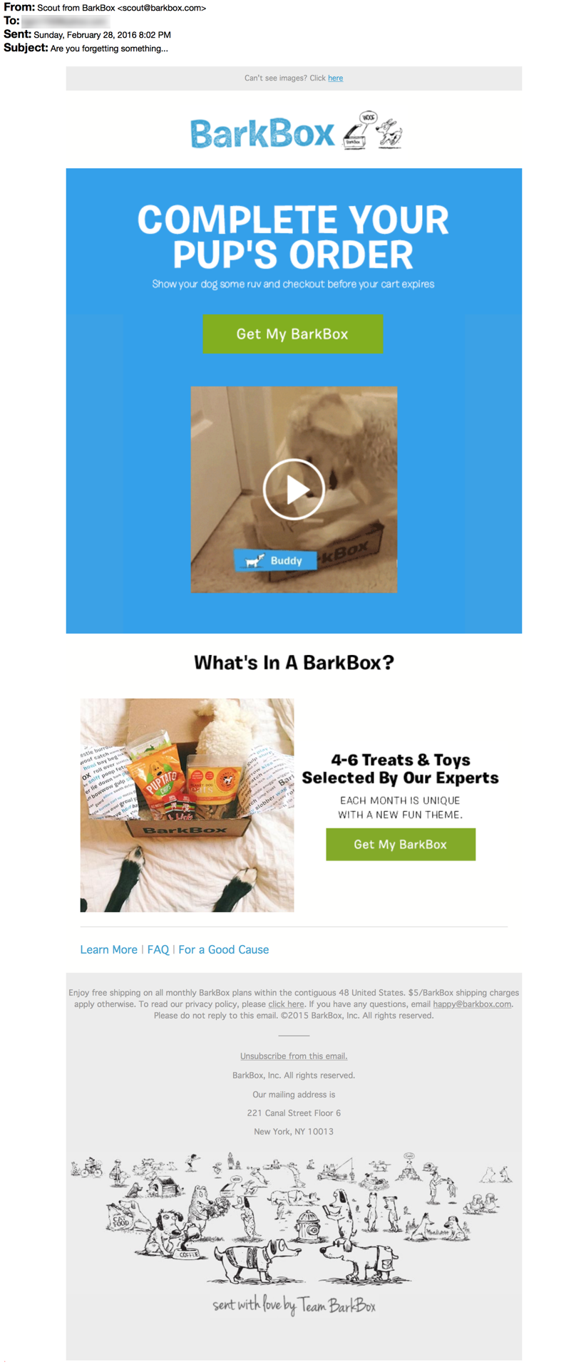
- Email #1: “Are you forgetting something…”
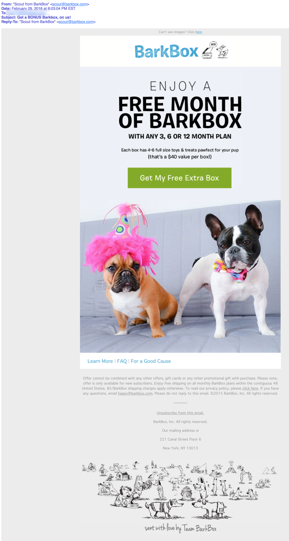
- Email #2: “Get a BONUS Barkbox, on us!”
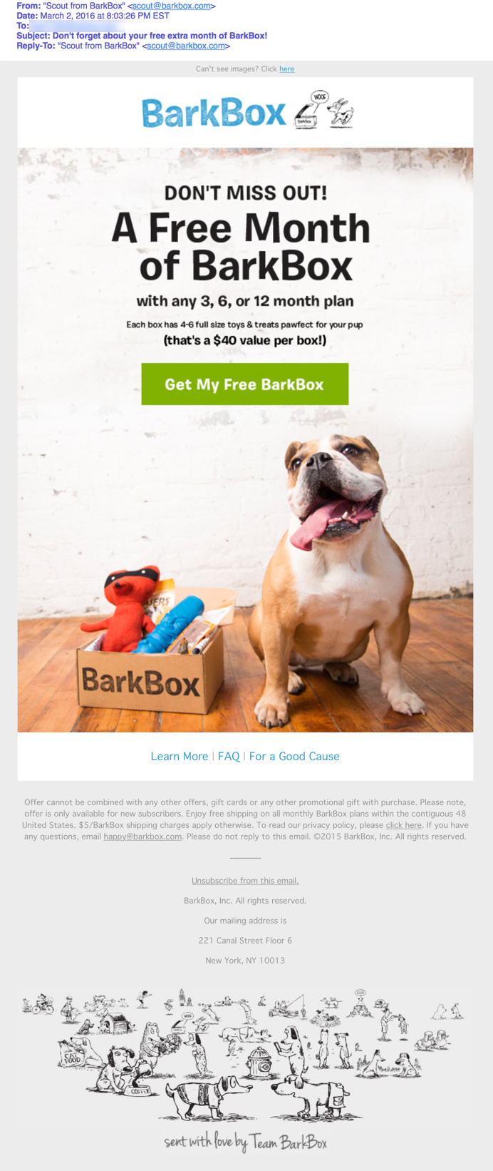
- Email #3: “Don’t forget about your free extra month of BarkBox!”
The email sender is “Scout from BarkBox.” So, together with the subject lines, the recipient knows that these emails are about the online order that she recently started. Given the fun pet product marketed by this company, however, these subject lines could have been a lot more playful in tone.
Perhaps the ellipsis in the first subject line was used to help it stand out in the inbox. However, because the subject line is posed as a question, using a question mark instead of the ellipsis would be more fitting (and correct) punctuation.
From the subject lines for emails #2 and #3, recipients know that if they complete their orders, they’ll get a free BarkBox. (However, there’s a typo in subject line #2 – the company uses an uppercase “B” for the “Box” in BarkBox.)
The Preview Panes Are Weak and the Eye Paths Could Be Improved
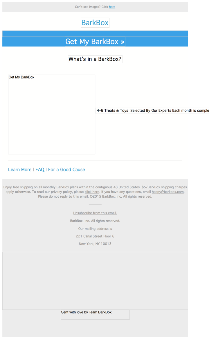
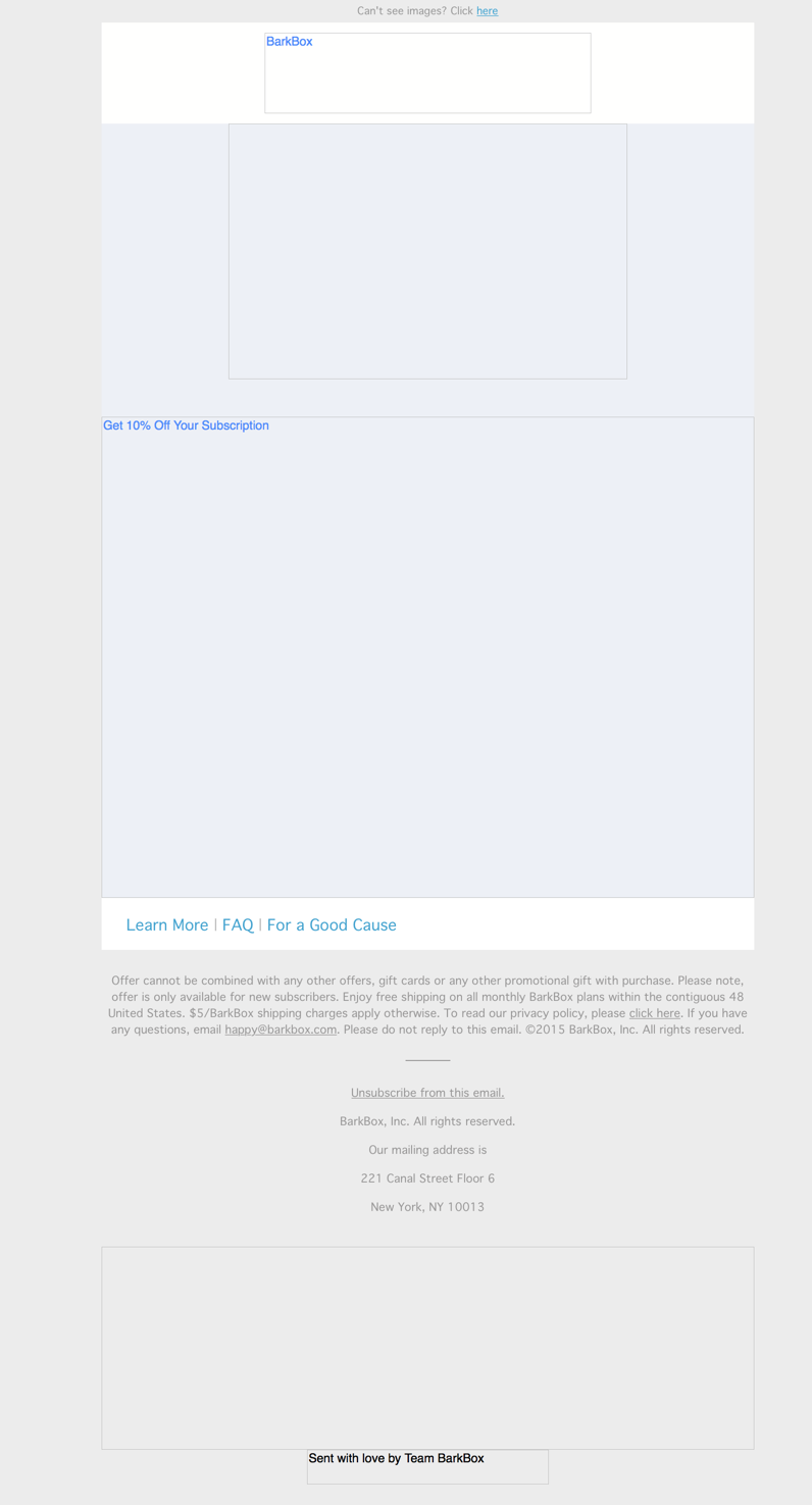
In addition to not including a call to action, the preview panes without images for this email series don’t use alternative text effectively. In addition, it appears as though they weren’t coded to have a set width, so the appearance loses its value.
The eye paths in all three emails could be improved. In the first email, the recipient’s attention is drawn to the video of the cute puppy trying to open a BarkBox; however, clicking on the video takes recipients to a “Create Your Account” page, not the abandoned cart. In addition, the blue background in the design seems to end abruptly. The eye paths in emails #2 and #3 are better, leading recipients’ attention to the call-to-action buttons.
Great Offer That Could Have Been Touted More Prominently
The message is simply and clearly presented in this abandoned-cart series, beginning with the headline in the first email – “COMPLETE YOUR PUP’S ORDER” – to the headlines in the following two emails, which speak to the incentive offer of a free BarkBox with the purchase of any three-, six-, or 12-month subscription.
The offer is great, but it could have been presented in a better way to more effectively emphasize its value. Although it’s mentioned in the copy, the fact that a free BarkBox is valued at $40 is something to be promoted more prominently, such as in the subject lines and headlines.
Calls to Action Do Their Job
The bright-green call-to-action buttons stand out in the email design. Plus, the call-to-action copy in the three emails is clear and user-centric:
- Email #1: “Get My BarkBox”
- Email #2: “Get My Free Extra BarkBox”
- Email #3: “Get My Free BarkBox”
Except for the subhead in the first email, which tells the recipient to “Show your dog some ruv and checkout before your cart expires,” there’s no sense of urgency in this email series. Setting a deadline for the free BarkBox offer, for example, would be one way to help drive more conversions.
Emails Are Both Cute and Highly Credible
The credibility is good for this series. In addition to showing the contents of a couple of boxes with a variety of treats and toys, links are provided to “Learn More,” “FAQ,” and “For a Good Cause” (to explain specifically where a portion of the BarkBox profits is donated). In addition, the dog cartoon at the bottom with the caption, “Sent with love by Team BarkBox,” is a nice touch.
Overall, this abandoned-cart email series is clever and full of cuteness. The photos (and video) of adorable dogs is a surefire way to capture the attention of the company’s target audience of dog owners. We noticed that the dogs featured in this campaign were medium-sized dogs, which is the size of dog this recipient had indicated that she owns. That would be a great way for a brand like BarkBox to segment its email list – sending emails with photos of dog breeds that are similar in size to those owned by prospects and customers.
Disclaimer: FulcrumTech does not have access to the performance data relating to this promotional email, so any tests performed on this email can’t be reflected in FulcrumTech’s commentary.

