Trello Email Review: Does It Need to “Get A Grip” and Be More Focused?
Trello Email Grade: [C-]
Subject Line | 1 |
Preview Pane | 3 |
Eye Path | 3 |
Clarity of Message | 3 |
Call to Action | 2 |
Offer | 4 |
Credibility* | -- |
Sense of Urgency* | -- |
Email grades are based on a 5-point scale: A = 5, B = 4, C = 3, D = 2, F = 1
*Not applicable.
November 1, 2016 –
Organization Overview
Trello is a Web-based visual project system that was created by Fog Creek Software in 2011 and spun off as an independent company in 2014. Available for desktops, mobile phones, and tablets, this free application features a drag-and-drop interface that enables users to organize and prioritize their work projects and personal life through a series of boards, lists, and cards. A paid Business Class version of the app is also available that can integrate with such favorite tools as Salesforce and GitHub.
Subject Line Has Personality But Lacks Relevance
“Get A Grip”
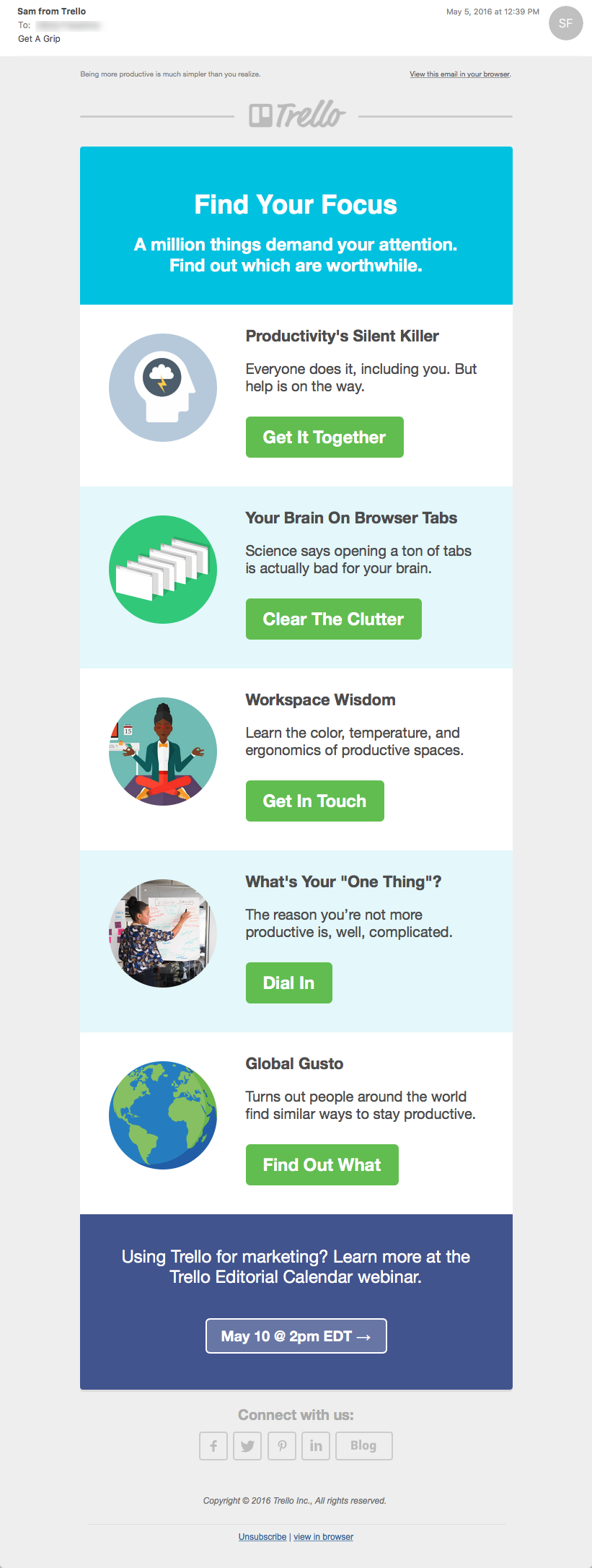
That’s the subject line of a nurturing email that was sent to someone who signed up with Trello. Although it has personality and may capture your attention as you scan the inbox, this subject line lacks specificity and relevance. So, unless it really piques subscribers’ curiosity, it may not get the open. Examples of subject lines that would be more informative and congruent with the email’s headline (“Find More Focus”) and content include “5 ways to find your focus at work” and “How to be more productive at work.”
Preview Pane Presents Pertinent Copy
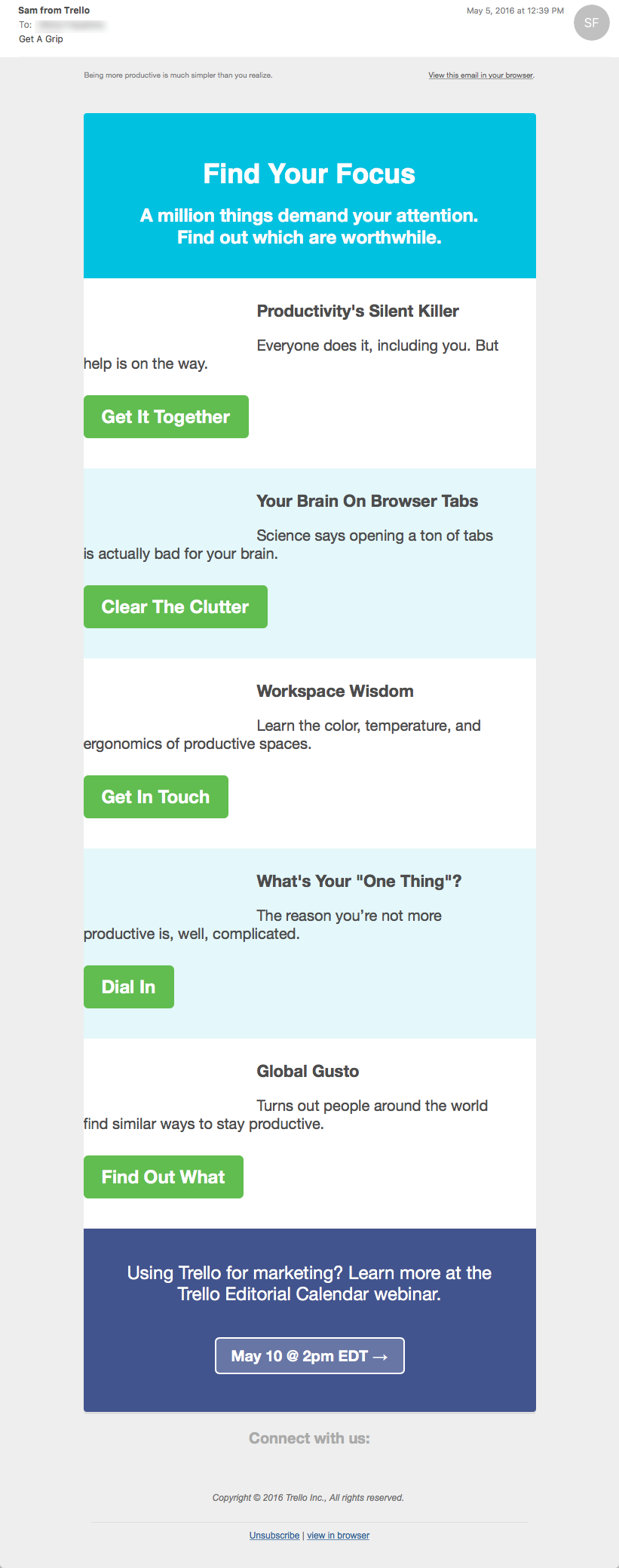
The preview pane without images presents all the pertinent copy and includes all the calls to action that are contained in the email message. However, the spacing of the copy and calls to action in each of the five sections is skewed, which results in a disorganized design that is hard to read. On the other hand, the eye path in the email message is strong and straightforward, with the five call-to-action buttons centered and aligned vertically with each other.
The Offer Is Strong, But the Value Is Inadequately Communicated
The offer is also strong: free content about how to increase productivity in the workplace. But the blurbs about each of the article links could be improved by being more engaging and informative. How does the content of each of the articles benefit readers? That’s not clear in the email copy.
Calls to Action Are Pithy and Full of Personality, But Do They Get the Click?
Similar to the subject line, the copy on the call-to-action buttons is pithy and has personality: “Get It Together,” “Clear the Clutter,” “Get in Touch,” “Dial In,” and “Find Out What.” But even in combination with the article descriptions, the call-to-action copy doesn’t say enough to motivate engagement and drive clicks. In addition, only the call-to-action buttons are clickable. Making everything clickable (e.g., image icons and article descriptions) would also encourage more clicks.
Used by millions, Trello is a helpful organizational app. And sending nurturing emails is a great way to stay top of mind with users, especially in markets that are crowded with similar products. Plus, the primary message of this email — tips about how to increase productivity in the workplace — is valuable information for the app’s users. To get the click, however, the value of the content needs to be more clearly communicated, starting with the subject line and continuing through the article descriptions and calls to action.
Disclaimer: FulcrumTech does not have access to the performance data relating to this promotional email, so any tests performed on this email can’t be reflected in FulcrumTech’s commentary.


