7 Ways to Make the Most of the "Click-Through Moment"
Although there are many elements that go into a successful email marketing campaign, there’s one critical moment during the conversion when your prospect is going from your promotional email (or online ad) to the landing page. Let’s focus on that split second – what I refer to as the "Click-Through Moment" – and specific ways you can drive great conversion rates and maximize your return-on-investment.

Dissecting the Click-Through Moment
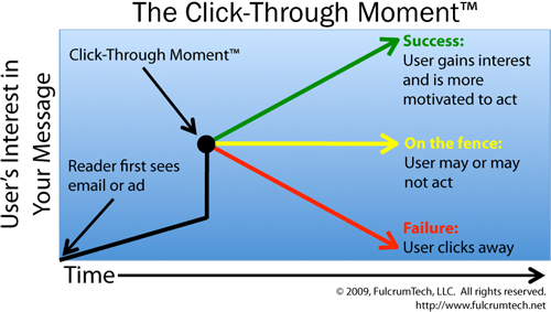
The diagram above illustrates the user’s interest in your message during the Click-Through Moment:
- First, an email recipient reads through your email or a Web surfer looks at your pay-per-click ad. If the promotion does what it’s supposed to, the reader becomes increasingly interested in the message – as demonstrated by the black upward-sloping line.
- Once users make the decision to click, either everything comes to a grinding halt (driving them down the red line of failure) or you increase their interest and compel them to take action (driving them up the green line of success).
The path that is taken during the Click-Through Moment is largely determined by the success of the landing page. Keep in mind that prospects are motivated to read what you have to say when they get to the landing page: They’ve already made up their mind that they are interested in your value proposition and are preconditioned to hear your message.
To help you make the most of your Click-Through Moments, we suggest these 7 drivers for creating a great first impression:
1. Consistency is key.
The instant prospects arrive at your landing page, they must immediately know that they are in the right place. Consistency in the wording of the message and design treatment – across all of the major elements of your email campaign – is the most important way to make this happen. These elements include:
- The email or ad
- Wording of the link to the landing page
- Headline on the landing page
- Design and colors across the email/ad and landing page
- The link or call-to-action button on the landing page
2. Send them to the right place.
Your original email or online ad communicates a certain value proposition that resonates with prospects, motivating them to click through. So follow through by taking them to a single-purpose landing page. If you don’t continue the discussion you started by repeating it on the landing page, you deflate your prospect’s interest. Too many times marketers send prospects to a generic Web site’s home page to search for the relevant link. And too many times these prospects lose interest and click elsewhere.
3. Make the value proposition clear.
It’s your value proposition that has gotten prospects to the landing page, so you’d better let them know right away they’re at the right site to learn more. Since the title is typically the first copy prospects will read, putting the value statement in the title is an important way to help minimize confusion and maximize conversion rates.
4. Design for scan-ability.
When visitors first arrive at your landing page, they quickly glance at the title, visuals, subhead, buttons, etc. That’s why it’s essential that the design and copy work together to effectively communicate your message. If you clutter the page with various design elements, graphics and multiple columns of text, your conversion rates will suffer. In addition, don’t provide visitors with "escape routes" – links to go elsewhere on your Web site. Instead, create stand-alone landing pages that direct the visitor to the desired call to action.
5. Provide multiple calls to action.
Make it easy for visitors to take action as soon as they’re ready by including multiple opportunities to do so. Putting call-to-action buttons on the top, in the middle and on the bottom of your landing page is an effective way to do just that.
6. Build trust.
Security and guarantee seals, as well as testimonial blocks, are examples of ways to help build trust quickly. Although prospects may not read them in detail, their presence contributes to creating a positive first impression and encourages visitors to feel comfortable about reading on.
7. Don’t skimp on the copy.
Be sure to include the information you need to "seal the deal." If you take prospects to a page that only includes an order form, for example, you’ll likely lose them and credibility – a quick slide down the red line of failure.
When it comes to optimizing the Click-Through Moment – as well as the ROI for your email marketing campaigns – FulcrumTech can help. Click here or give us a call today at 215-489-9336 to discuss specific ways FulcrumTech can help you use email marketing effectively to move your business forward.