Get the Click: Travelzoo

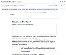
Preview without Images

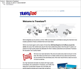
Preview with Images
Travelzoo Email Grade: D
Subject Line | 4 |
Preview Pane | 3 |
Eye Path | 2 |
Clarity of Message | 2 |
Call to Action | 1 |
Offer | 1 |
Sense of Urgency | 1 |
Credibility | 3 |
1/17/12 — This welcome email from Travelzoo starts out strong with a subject line and preview pane that let their new subscribers know this is a welcome to the rewards program that they recently signed up for: “Welcome to Travelzoo!” Because welcome messages are among the most frequently opened and read emails, they provide a huge opportunity to drive further engagement with subscribers. In the case of this welcome email, however, Travelzoo didn’t optimize that opportunity.
To begin with, the email is very text heavy and difficult to scan. One way that the scanability could have been greatly improved is by adding relevant subheads to break up the text.
This email’s overall objective is also not clear. As a result, without the guidance of such an overarching goal, developing a solid, effective eye path to an appropriate call to action is difficult. Even a welcome email should have a clear objective. In this case, TravelZoo has relationships with multiple vendors, so a special offer of some sort could encourage immediate engagement at the time the recipient is most willing to become engaged.
Related to the lack of offer, there’s no sense of urgency to drive some initial engagement. The only call to action is to “join the conversation” at Facebook. New subscribers have indicated an interest in finding out about travel and entertainment deals – the welcome email is the perfect opportunity to instantly give them what they’re looking for, and with a great sense of urgency.
As far as credibility, it’s there in the copy. But subscribers need to read through a lot of copy to find it. Making some of the most relevant information “pop” with a subhead or bolder copy would help readers quickly and easily spot it.
In summary, establishing a clear purpose for this email is most important. Then, creating a version of this welcome email with some subheads to break up the text would be great; the subheads could also build the interest and incentive for the recipient to read and take the desired action. Making it clear what you’re asking the reader to do and why he or she should do it is key. It would be interesting to see the improvements that varying the subheads and perhaps incorporating some relevant imagery would offer when compared back to this email as a control.
Disclaimer: FulcrumTech does not have access to the performance data relating to this promotional email, so any tests performed on this email can’t be reflected in FulcrumTech’s commentary.