Country Outfitter Email: Does It Make You Want to Kick Up Your Heels in New Cowboy Boots?

Preview without Images

Preview with Images
Country Outfitter Email Grade: C+
Subject Line | 3 |
Preview Pane | 2 |
Eye Path | 4 |
Clarity of Message | 4 |
Call to Action | 4 |
Offer | 3 |
Credibility | 5 |
Sense of Urgency | 1 |
11/26/12 —
Company Overview
Country Outfitter (http://www.countryoutfitter.com/) is a web-based retail store that sells a vast selection of cowboy boots and western apparel. Launched in 2011, Country Outfitter already has well over 3.6 million likes on Facebook, thanks to an apparently successful campaign of boot giveaway contests.
Subject Line — Does It Intrigue or Look Like Spam?
“♥ HOT. TAILGATE. BOOTS.” That’s the subject line for this promotional email sent from Country Outfitter to someone who had shared an email address on Facebook to win a pair of cowboy boots. At FulcrumTech, we were split about the effectiveness of this subject line. Some of us thought the rather cryptic choice of words was enticing, with the red heart making it stand out in the inbox. But for others it was “spammy.”
Symbols such as airplanes and stars seem to be popping up all over in subject lines. Do they work to drive opens for certain populations of email subscribers? It’s something that may be worth testing. If you’ve experimented with symbols in your subject lines, please share your findings with us.
Preview Pane Is Lacking
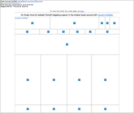
The preview pane without images is not very effective. A good tie-in to the headline is provided — “It’s finally time for football! Kick off tailgating season in the hottest boots around with Country Outfitter.” Plus, a link to a web version of the email is also included. Alternate text with an offer or call to action, however, would provide more incentive for subscribers to download the images in the email.
Credibility is High, Along with a Strong Eye Path and Call to Action
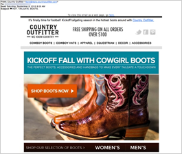
The eye path is strong, leading from the Country Outfitter logo to a headline and subhead that tie in to the subject line: “Kickoff Fall with Cowgirl Boots” and “The Perfect Boots, Accessories, and Handbags to Make Every Tailgate a Touchdown.” The eye is then drawn to attractive photographs of boots, a handbag, and “boot candy” — jewelry for boots. However, we did find that it was easy to miss the offer for free shipping on all orders over $100. Perhaps if that text displayed in a color other than black or was put in another location in the email, it would have more “pop.”
The call to action is simple but strong, “Shop Boots Now.” Plus, the orange call-to-action button located in the top fold stands out. This email was sent in early fall, and the main purpose seemed to be getting people excited about transitioning from summer footwear to fall footwear. Although that may be the case, there’s no sense of urgency created to encourage people to make a purchase. Some sort of incentive, such as free shipping for a limited time or a discount for the first 100 people who made a purchase, for example, may have helped drive more click throughs and conversions.
The high quality of the photography and design of this email, along with the reputable brands, contribute to a high credibility for Country Outfitter.
Disclaimer: FulcrumTech does not have access to the performance data relating to this promotional email, so any tests performed on this email can’t be reflected in FulcrumTech’s commentary.