join.me Email Review: Does It Take Recipients by Storm?

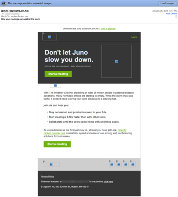
Preview with Images

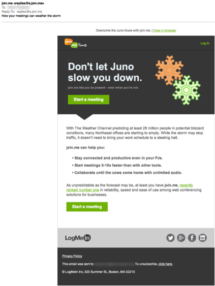
Preview with Images
join.me Email Grade: [B+]
Subject Line | 3 |
Preview Pane | 4 |
Eye Path | 4 |
Clarity of Message | 5 |
Call to Action | 4 |
Credibility | 5 |
Sense of Urgency | 5 |
May 5, 2015 –
Organization Overview
The online meeting and collaboration software join.me is a product of the company LogMeIn, Inc. Founded in 2003 and headquartered in Boston, LogMeIn is a provider of Saas and cloud-based remote connectivity services for IT management, collaboration, and customer engagement. Screen sharing, file transfer, Internet calling, mobile apps, one-click scheduling, and other meeting and marketing tools are available through join.me. According to the join.me website, not only is join.me easy to use, but also it provides the benefit of unlimited audio using Voice over Internet Protocol (VoIP) and dedicated conference lines in more than 40 countries.
Subject Line Capitalizes on Impending Winter Storm
This email was sent to a join.me customer as the Northeastern United States braced for a huge winter storm named Juno. The subject line – “How your meetings can weather the storm” – capitalized on the impending weather that was dominating the news at that time. Perhaps the subject line could have been made a bit clearer, however, by expressing the sentiment, “If you can’t get to the office, use join.me.”
Even without downloading images, recipients know what the email is all about in the preview pane. In addition, all of the links in the email are clickable in the preview pane. Other than possibly adding alternative text in the image boxes, this was an effective preview pane without images.
This email provides a great example of how an organization can use an existing email template for a quick turnaround to capitalize on a current event. In a previous Get the Click article, we reviewed another join.me email that appears to use the same template as this email.
Strong Eye Path and Messaging Is On Point
In this email, both the eye path and clarity of message are strong. The headline – “Don’t let Juno slow you down.” – is clear and works well with the subhead, “join.me lets you be present – even when you’re not.” The subhead would be easier to read and likely have more of an impact, however, if a bigger font had been used. Thanks in part to the three short bullets of copy, the email’s messaging is both on point and easy to read.
The copy and design effectively lead the reader’s eye to the two left-aligned, bright green call-to-action buttons. Not only are the calls to action prominent, but they also effectively communicate that readers can start a meeting with a simple click. In this email, there is no offer – and one is not necessary for this type of message.
Timely, Credible, and Professional
The timeliness of this email message in preparation for an imminent storm contributes to the high sense of urgency. In addition, this email also effectively builds credibility for join.me with the following copy:
- The second bullet: “Start meetings 5-10x faster than with other tools.”
- The link in the last sentence: “recently ranked number one in reliability, speed, and ease of use among web conferencing solutions for business.”
Overall, this email is professional in appearance and tone, as well as highly relevant for the Northeastern segment of join.me’s target audience.
Disclaimer: FulcrumTech does not have access to the performance data relating to this promotional email, so any tests performed on this email can’t be reflected in FulcrumTech’s commentary.