Love Your Melon Email Review: Does It Effectively Share the Love?
Love Your Melon Email Grade: [C+]
Subject Line & Preheader | 4 |
Preview Pane | 4 |
Eye Path | 3 |
Clarity of Message | 3 |
Call to Action | 4 |
Offer & Urgency | 2 |
Congruency | 3 |
Email grades are based on a 5-point scale: A = 5, B = 4, C = 3, D = 2, F = 1
April 4, 2017
Organization Overview
Love Your Melon is an apparel company that was founded in 2012 by two friends in an entrepreneurship class at the University of St. Thomas in St. Paul, Minnesota. With a mission to improve the lives of children fighting cancer, Love Your Melon started out with the goal of giving a hat to every child with cancer in the United States. Love Your Melon products include a variety of the company’s signature cuffed and uncuffed beanies for adults and children, as well as mittens, scarves, caps, and sweatshirts. All Love Your Melon products are manufactured in the United States.
Once Love Your Melon met their original goal (giving out 45,000 hats), the company set a new goal of donating $1 million to pediatric cancer research and the support of children with cancer and their families. To accomplish this, 50% of the profits from the sale of all Love Your Melon products is donated to the company’s nonprofit partners in the fight against pediatric cancer. According to the Love Your Melon website, the company has currently donated more than $2.6 million and 91,000 hats.
Subject Lines Combined with Preheaders Get the Job Done
This email campaign was sent to a Love Your Melon fan and customer to announce the release of some new products: beanies for children, beanies and cuffed beanies, and sweatshirts. The campaign series consisted of a teaser email sent on the Friday before the products were available for purchase and a second email sent on the following Monday when the new products were released.
The following were the subject lines for each of the emails:
- Email #1 — “Kids Beanies, Sweatshirts and More!”
- Email #2 — “Kids Beanies – Now Live!”
These subject lines get the job done, in that people know what to expect if they open the emails. However, they both could be a bit more fun and creative.
The preheader for Email #1—”We hope you’re as excited as we are for this great day of releases, on Monday, February 27!”—helps supplement the information in the subject line (as well as add some excitement) by letting recipients know that new products are about to be released in a couple of days.
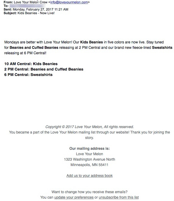
The preheader in Email #2 repeats the subject line and then supplements it with copy that first appears in the email message: “Mondays are better with Love Your Melon! Our Kids Beanies in five colors are now live! Stay tuned for Beanies and Cuffed Beanies releasing at 2 PM.”
Room for Improvement in the Preview Panes and Eye Paths
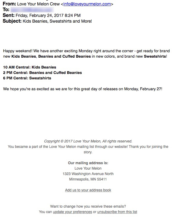
The preview panes without images in Email #1 and Email #2 provide all the pertinent information about Love Your Melon’s new product release. However, there’s no call to action and no motivation (e.g., image boxes with alternative text) for subscribers to download images.
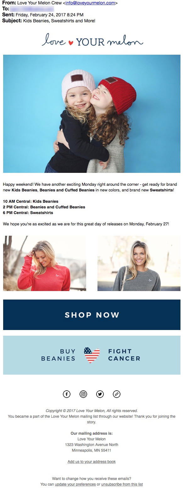
The eye path in the first email is stronger than in the second. That’s because there are too many product shots in the second email. Showing subscribers every beanie in every color available isn’t the most effective use of the space, especially since it results in placing the call to action so far below the fold.
The call to action is strong—it’s big, bold, and stands out, especially in Email #1. A second call to action added above the fold and closer to the top of Email #2 would likely help drive more conversions. Having a call to action above the fold is especially important in Email #2, since it’s announcing that the new products are released and available for purchase that day.
Adding Headlines Would Improve Clarity of Message and Congruency
With a few design tweaks, the eye paths, clarity of message, and congruency between the subject lines and email content of both emails could be improved. For example, the photographs take up a lot of real estate, overpowering the email message. And, while the images are high quality and show off the products nicely, adding a headline to both of the emails would help highlight the main message of the campaign. A seal or burst added to the images that displays copy such as, “Coming February 27!” (on Email #1) and “Releasing today!” (on Email #2), would also help quickly clarify the main purpose of each of the emails.
Sense of Urgency Is Lacking
The offer of this email campaign is the availability of Love Your Melon’s latest beanies and new sweatshirt line. And the email series does a good job of building excitement by: 1) sending a teaser email a couple days before the items can be purchased, and 2) releasing each product at a different time, which is clearly outlined in the copy of both emails. But other than capitalizing on a customer’s desire to have the latest products, there’s no urgency to drive purchases. Although the company may not want to give a discount on its new products, a statement such as “limited quantities will sell out quickly” would help create a sense of urgency to convert.
Love Your Melon is a company built on the laudable mission of helping children with cancer, donating 50% of its profits to this cause. In addition, Love Your Melon’s products are high quality and all made in America. This email series reflects the company well with effective images, a strategy that creates an air of excitement by releasing each new product at a different time, and a banner near the bottom of each email reminding recipients of the mission: “Buy Beanies Fight Cancer.”
Disclaimer: FulcrumTech does not have access to the performance data relating to this promotional email, so any tests performed on this email can’t be reflected in FulcrumTech’s commentary.


