MeUndies Email Review: Does It Motivate You to Refer a Friend?
MeUndies Email Grade: [D]
Subject Line and Preheader | 2 |
Preview Pane | 3 |
Eye Path | 2 |
Clarity of Message | 1 |
Call to Action | 1 |
Offer and Urgency | 3 |
Congruency | 1 |
Email grades are based on a 5-point scale: A = 5, B = 4, C = 3, D = 2, F = 1
December 13, 2016 –
Organization Overview
Founded in 2011 and based in Beverly Hills, California, MeUndies is a direct-to-consumer business that describes itself as “the place to go for the perfect pair of underwear.” In addition to men’s and women’s underwear, MeUndies also manufactures and sells basic apparel, such as T-shirts, lounge pants, socks, and sweat shorts. The products are sold online, as well as directly from MeUndies’ warehouses. MeUndies sells its underwear individually or in packs, or customers can sign up at the company’s website to get a new pair of underwear mailed to them monthly.
Subject Line Lacks Incentive to Drive Opens
This email was sent to a loyal customer of the MeUndies brand. “MeUndies are best shared with friends.” is the email subject line, which was followed by the preheader, “Do you remember life before MeUndies?” (The preheader copy is the same as the first line in a letter featured in the email.)
When it comes to email subject lines, clarity trumps creativity. In this case, the purpose of the email is to get current customers to refer MeUndies to their friends. That’s indicated to subscribers in the subject line. But there’s no motivation to drive people to open the email, such as the great incentive included in the email message. Promoting that offer (a $20 store credit for each referral who makes a purchase) in the subject line and/or preheader likely would have encouraged more recipients to open the email.
Missed Opportunity in the Preview Pane
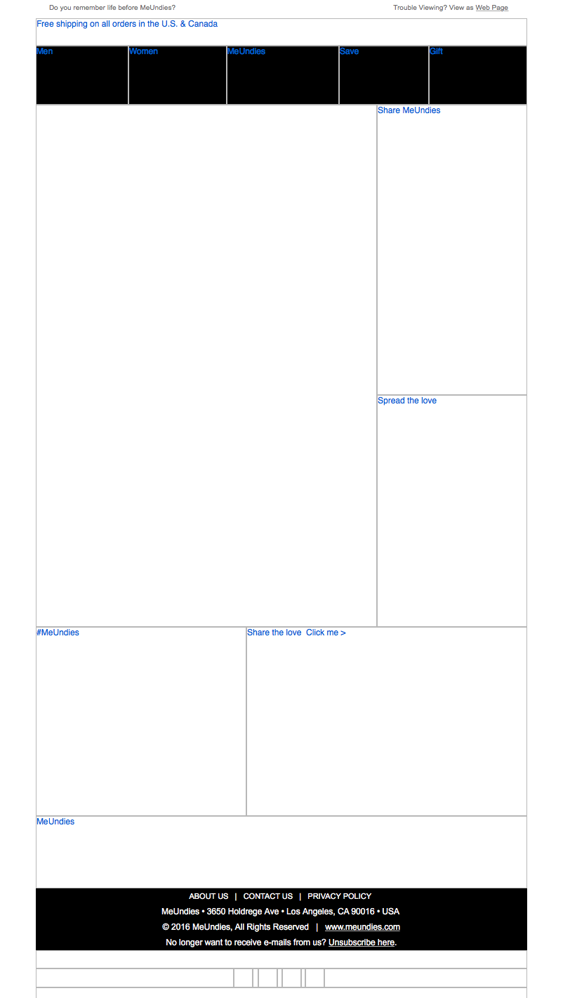
The preview pane without images has a clean appearance but lacks any alternative text to entice subscribers to download the images. There’s also a missed opportunity in that the letter in the email (which communicates pertinent information about the offer) could have been displayed fully in HTML. In addition, the call to action is not included in the preview pane.
Weak Eye Path and Unclear Email Message
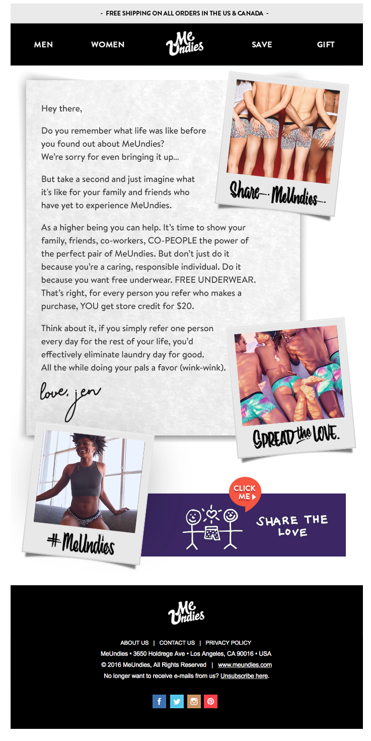
The eye path is weak, featuring a four-paragraph, long-form letter. To make the copy in the letter easier for subscribers to read or scan, it either should be shorter (e.g., one paragraph) or use subheads, bullets, and boldface to highlight the major points, such as the offer. Plus, the call to action is not obvious when first glancing at the email. Subscribers must search for the tiny “CLICK ME” dialog bubble in the purple “SHARE THE LOVE” banner near the bottom of the page. In terms of the eye path design, including a masthead that uses the same purple color and features the headline “Share the love” would help draw subscribers’ attention to the call to action.
For similar reasons, the email message isn’t clear. Unless subscribers read the entire letter, they won’t discover the $20 offer, which isn’t mentioned until the end of the third paragraph. It’s a great offer and one that likely would prompt some customers to refer MeUndies to their friends. But the offer would have been much more effective if it were clearly promoted at every stage of the email—from the subject line and preheader, to the headline, in easier-to-read copy, and finally in the call to action.
Great Offer, But It’s Buried in the Email Copy
With the only call-to-action copy being “SHARE THE LOVE” and “CLICK ME,” there’s no benefit presented to subscribers to help get the click. Neither is there any clear and congruent story that ties together the various email elements to let subscribers know what they’re supposed to do and give them any motivation to do it.
Refer-a-friend email campaigns are a cost-effective way for companies to generate new leads. In this email from MeUndies, the copy is cute and creative. The design is also unique, cutting through the clutter of many typical promotional emails being sent today. But recipients must read through a lot of copy in this email to figure out the offer and search for the call to action. Promoting the value of the offer from the start (e.g., in the subject line, preheader, and headline) would likely increase the opens, clicks, and overall performance of this refer-a-friend email.
Disclaimer: FulcrumTech does not have access to the performance data relating to this promotional email, so any tests performed on this email can’t be reflected in FulcrumTech’s commentary.


