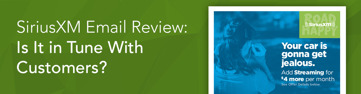
SiriusXM Email Review: Is It in Tune With Customers?
SiriusXM Email Grade: [C]
Subject Line & Preheader | 2 |
Preview Pane | 3 |
Eye Path | 2 |
Clarity of Message | 4 |
Call to Action | 3 |
Offer & Urgency | 4 |
Congruency | 3 |
Email grades are based on a 5-point scale: A = 5, B = 4, C = 3, D = 2, F = 1
January 4, 2017 –
Organization Overview
Owned by SiriusXM Holdings, Inc., SiriusXM is a satellite radio and online radio service that offers more than 175 channels, including commercial-free music, live play-by-play sports, and news talk and entertainment. SiriusXM has arrangements with major car companies for installation of satellite radio in their vehicles. In addition to being available in vehicles, SiriusXM can also be accessed online through smartphones, computers, and tablets. With headquarters in New York City, SiriusXM currently has more than 30 million subscribers.
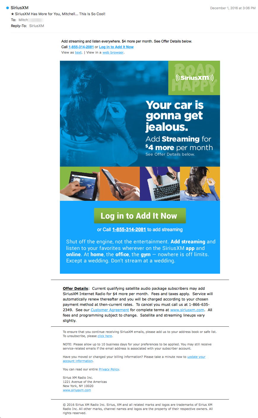
Subject Line and Preheader Fail to Convey Value
“★ SiriusXM Has More for You, Dan… This Is So Cool!”
This is the subject line of a promotional email that was sent to a SiriusXM subscriber. When it comes to optimization, this subject line wastes valuable real estate by frontloading the company name that already has been used in the sender address. It also appears that the goal of the subject line was to pique curiosity and encourage subscribers to open the email. But the description is too vague and doesn’t convey any value. If the offer is really “so cool,” tell subscribers about it.
A star image is also used in the subject line. Does it draw attention in the inbox and help increase open rate? In some cases, images and emojis are successful in doing just that. However, only testing will tell if using images in subject lines works for your target audience.
The preheader supplements the subject line by including the email offer: “Add streaming and listen everywhere. $4 more per month. See Offer Details below.” In addition, the preheader provides a call to action (“Log in to Add It Now”), a clickable phone number, and links to view the email as text and in a web browser. However, there’s no value proposition in either the subject line or preheader. The preheader also uses disclaimer language, which fails to create excitement for the offer.
Preview Pane and Eye Path Could Be Stronger
This preview pane without images uses alternative text and provides the pertinent information included in the email message, as well as the call to action. But the copy doesn’t entice subscribers to download images.
The eye path is disjointed, thanks to many competing and distracting elements, including several font sizes and styles, white text over a blued-out image (noticeably the same as one of the smaller images featured below), and a strip of four images above the call to action. These four images interrupt the eye path and draw attention away from the call to action. In addition, the white text is difficult to read and the “offer details” at the bottom of the page look like a disclaimer.
Clear Message, Good Offer, and Prominent Call-to-Action Button
The message and offer are clear: add streaming for $4 more per month. But subscribers have to work to find that information. The headline, “Your car is gonna get jealous,” for example, doesn’t tell subscribers anything about the email offer. Although the subhead includes the offer, it’s not until the paragraph of copy below the call-to-action button that any of the benefits of streaming are explained. Putting that information into a few easy-to-read bullets would help clarify why subscribers would want to add streaming.
The bright-green call-to-action button is large, centered, and stands out on the page. But the copy on the call-to-action button—”Log in to Add It Now”—is long and doesn’t showcase value or provide incentive for subscribers to click through. “Get streaming now,” is an example of more focused and customer-centric copy for this email’s call to action.
A Sense of Urgency Can Help
This offer is likely ongoing and the email an automated message sent to current SiriusXM customers. Typically, a sense of urgency helps prompt a prospect to action. So, some sort of time-sensitive aspect to the offer could help with conversions in this case. Test different offers month over month in the automation, for example, to see which sense of urgency might have the most impact on sales.
Finally, the offer and call to action are included in the preheader; however, the congruency from the subject line to the headline and email message could be stronger. As far as congruency from the call to action to the landing page, clicking the call-to-action button leads to a log-in page, so the copy “Log in to Add It Now” makes sense.
SiriusXM is a leading brand among satellite radio providers, and this offer to stream your favorite Sirius channels for $4 a month is a good one. Making the email message more customer-centric and the benefits of the streaming feature more clear and prominent—from the subject line to the headline and email copy, to the call to action—would likely help drive opens, clicks, and conversions for this campaign.
Disclaimer: FulcrumTech does not have access to the performance data relating to this promotional email, so any tests performed on this email can’t be reflected in FulcrumTech’s commentary.