8 Great Emails That Show You How to Get the Click
8 Great Emails That Show You How to Get the Click
Looking for inspiration to create emails that your subscribers actually open and click? Then check out these examples of exceptional emails that have been evaluated by FulcrumTech experts for our monthly NewsLever Get the Click column.
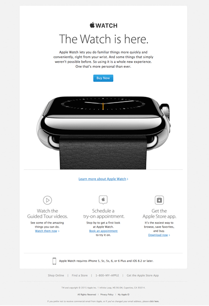
- Apple—A is for apple, and this email got an A.
This email starts out with a simple subject line that boldly says it all: “Apple Watch is here.” Similar to the market release of other Apple products, the public was primed for this news. So, subscribers who were interested in the Apple Watch would open the email to find out more. A clean design, clearly communicated message, and a bright blue “Buy Now” call-to-action button make it easy for motivated customers to quickly convert. The email stays true to Apple’s highly successful promotion of its iconic brand, creating the perfect email message for loyal Apple fans.
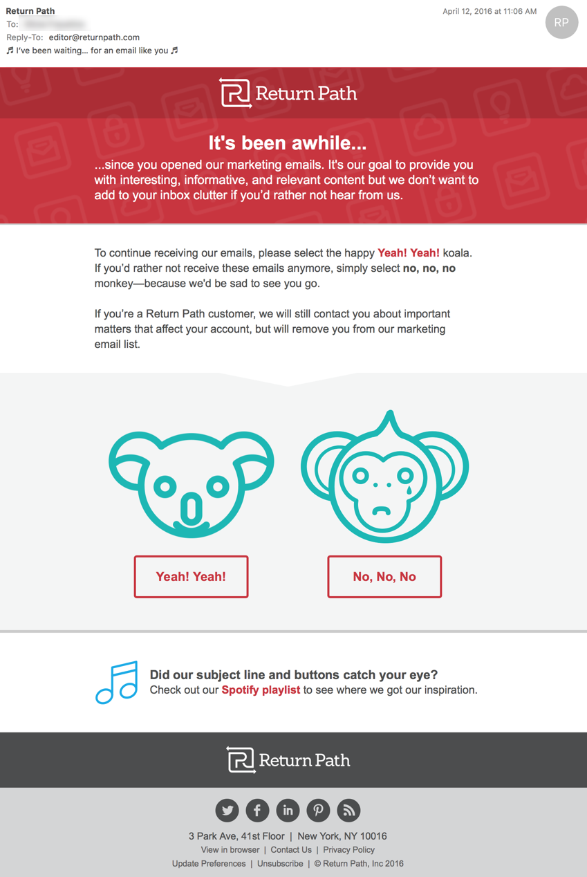
- Return Path—This reengagement email makes it hard for subscribers to say goodbye.
This is a great example of a simple, smart reengagement email that successfully uses humor to grab subscribers’ attention. With the creative subject line—”♬ I’ve been waiting…for an email like you ♬”—this email stands out in the inbox. Plus, the straightforward reengagement message starts with the headline, “It’s been awhile…,” and leads to GIFs of a smiling koala bear and a crying monkey that effectively catch the eye and draw attention to the clever copy in the call-to-action buttons.
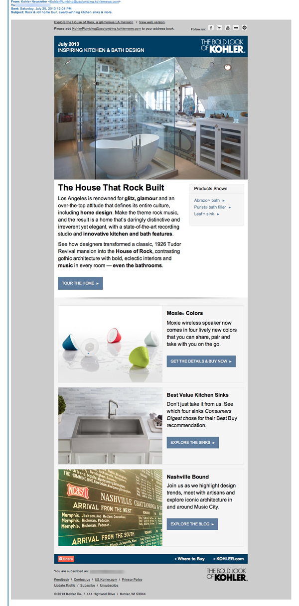
- Kohler—This email newsletter has everything, plus the kitchen sink!
The sender line—”Kohler Newsletter”—lets subscribers know right away that this is the company’s monthly newsletter. The subject line, “Rock & roll home tour, award-winning kitchen sinks and more,” piques curiosity and drives subscribers to open the email to take the tour of the “rock & roll” house. The design is clean and the article descriptions succinct. Plus, the call-to-action copy is customized for each article (e.g., “TOUR THE HOME” and “EXPLORE THE SINKS”), which make them so much more interesting than the usual “Read more” call-to-action buttons often found in e-newsletters.
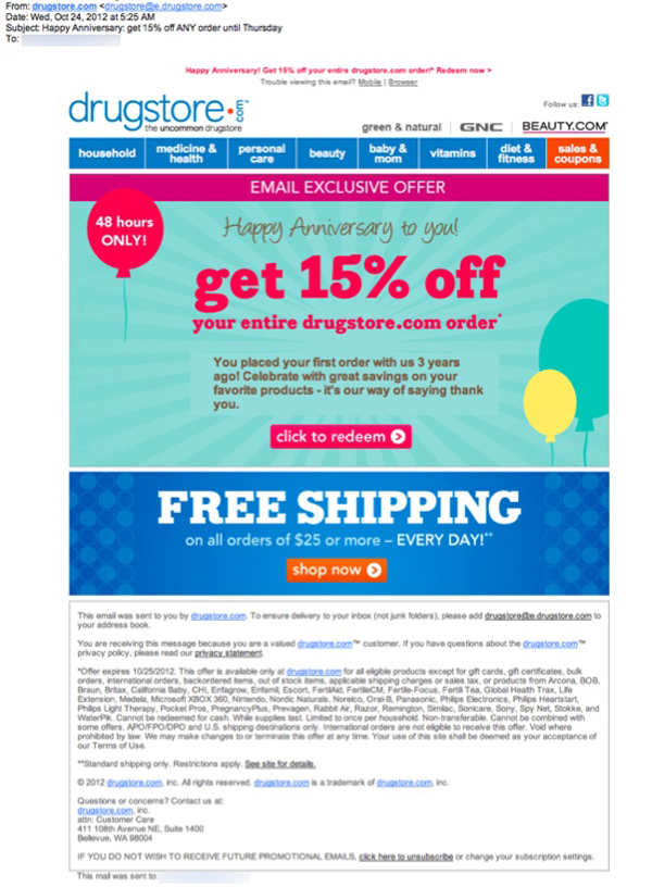
- Drugstore.com—Shows what it takes to deliver a healthy, nurturing campaign.
This triggered email was sent to a subscriber on her third anniversary of placing an order with drugstore.com. The subject line quickly sums up the email content: “Happy Anniversary — get 15% off ANY order until Thursday.” Not only is the offer included in the subject line, but it conveys a sense of urgency to drive action. The design is fun, simple, and clearly communicates the email message, making it easy for recipients to quickly digest the content and convert.
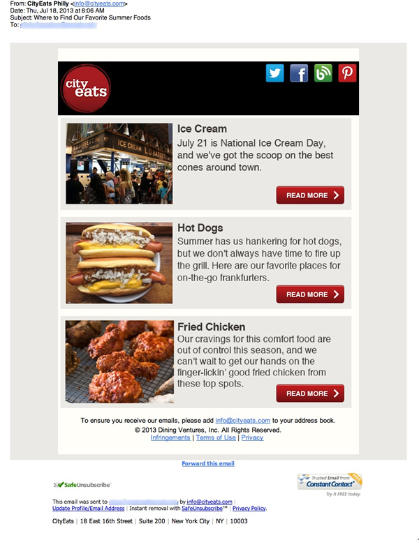
- CityEats—This Philly restaurant e-newsletter is indeed a tasty treat.
Starting with a strong subject line—”Where to Find Our Favorite Summer Foods”—this e-newsletter does a great job of keeping CityEats top of mind as the go-to website for restaurant reviews, recommendations, and reservations in major U.S. cities. The design is clean, simple, and effective, including high-quality photography and just the right amount of copy to describe each article and let subscribers know what they’ll find when they click through. Plus, the bold, red, call-to-action buttons can’t be missed.
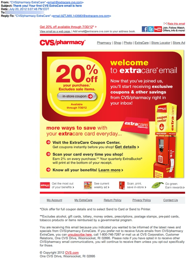
- CVS/pharmacy—This triggered email is just what the doctor ordered.
Sent to a customer who was promised a 20%-off coupon in return for updating his email address during an in-store transaction, this trigger email was sent promptly within minutes. The subject line works well, especially because the customer was expecting it: “Thank you! Your first CVS Extra Care email is here.” The email contained a prominent and easy-to-redeem coupon, increasing the likelihood that subscribers will open and use the coupon and help drive additional sales.
- Musicnotes.com—This update-your-preferences email is pitch perfect.
“Complete Your Preferences and receive a $6 coupon!” This subject line not only communicates the main purpose of the email, but it reveals the $6 incentive offer to help drive more opens. Once opened, the email message is crystal clear and the centered, bright-green, call-to-action button can’t be missed.

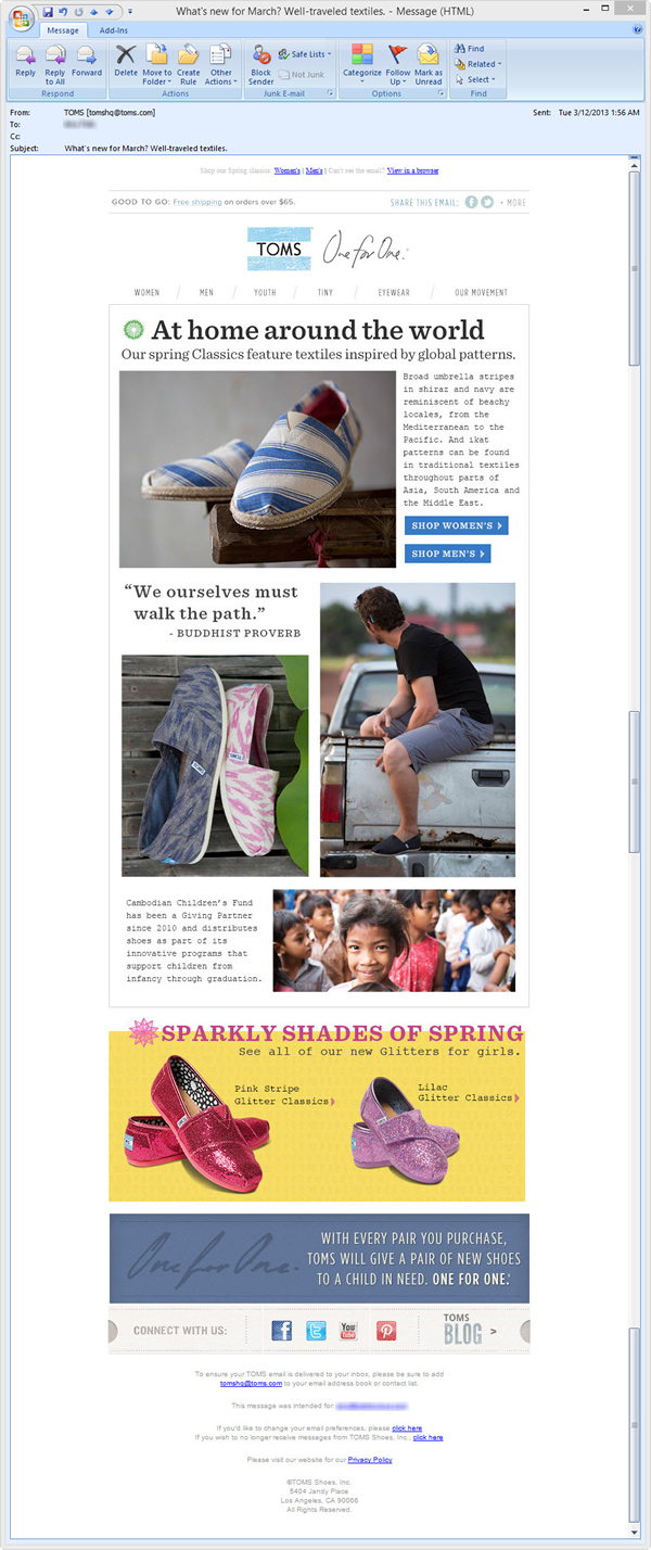
- TOMS Shoes—Stepped up with a responsive email design.
This email stood out because of its outstanding use of responsive coding to optimize the design layout for all platforms and devices. For example, the mobile design, displayed in a single column, included calls to action that were large enough to view and easily use on a touch screen and rotated the images that were featured on full-screen devices so that mobile users could see all of them. Plus, TOMS’ email message, offer, and philanthropic mission (for every pair of shoes purchased, another pair is donated to a child in need) are all clearly and effectively presented in this promotional email.
What do you need to do to optimize the opens and clicks of your email campaigns? Contact FulcrumTech, and our email-marketing experts will develop an effective strategy to help ensure you get the click!